How to create a design system in Figma that scales
12 min read
Strong Figma design systems start with clear decisions, not components. This tutorial breaks down how to structure those decisions across foundations, design tokens, components, code, and AI workflows.

Founder of Design Systems Surf

So, what is a design system in Figma? A design system in Figma serves as an operational structure for repeated product decisions: how color conveys meaning, how spacing creates rhythm, how components behave and how design connects to code, documentation and AI-assisted work.
That distinction matters whether you build a system from scratch or audit an existing product. A fresh system needs enough real interface context to avoid becoming another generic UI kit, while an existing system needs an audit before current inconsistencies become reusable assets.
A design system truly begins when product decisions become consistent enough to reuse.
This guide explains how to create a design system in Figma step by step, from defining scope to when you publish your first working version. You don't need every foundation, component, or doc finished before launching. You just need clear, reusable decisions that teams, code and AI tools can build on without re-inventing the logic each time.



PRO
Start with system context
Before you set up variables or components, define the environment your system will support. This sets a clear boundary and stops your library from bloating with generic assets. It also gives developers and AI tools the context they need to apply rules correctly without guessing based on visual appearance.
A Figma library is not a complete design system
A Figma design system often starts as a shared library. Teams collect colors, typography, Figma variables and core components into one file, then publish them across product files. This improves consistency, but a library only shows what is available. A design system explains how those assets should be used.
Consider three common color variables: gray-500, text-secondary, and border-muted. They might look identical on canvas, but they serve entirely different purposes: gray-500 is a raw color value, text-secondary defines visual hierarchy for text, and border-muted creates subtle surface separation.
If those roles are unclear, designers choose variables by appearance rather than logic. AI tools will do the exact same thing.
While a library makes visual assets reusable, a design system scales the underlying product decisions. That distinction should guide how the file is structured from the beginning.
Decide what the system needs to support
Next, define what your system is actually for. Don't start with a giant component checklist or a generic Figma design system template. Focus on the real products, platforms, teams and workflows you need to support right now.
A mobile consumer app and a complex desktop platform both need buttons, inputs and navigation. But they need very different rules for density, layout, accessibility, interaction and responsive behavior. If you look at famous Figma design system examples like IBM Carbon or Google Material, you can see how different design systems adapt to different product needs.
Your scope doesn't need to be huge. It just needs to be clear. Decide which products and platforms are included, which recurring problems you want to fix, and what you are saving for later. This clarity also stops AI tools from giving generic advice that breaks your product rules.
Start with the smallest area where shared decisions create clear value. That could be a single product, one platform or a core user flow. You can always grow the system later, but version one needs a clear focus.
The AI-Ready Design System Roadmap can help you set these boundaries before you build or make your main Figma library. It breaks work into Define, Create, Adopt, and Evolve, so you can separate Figma decisions from codebase infrastructure and general documentation.

Audit the interface before creating the library
Once the scope is clear, inspect the interface before deciding what belongs in the system. If you work with an existing product, collect the colors, typography, spacing, layout patterns, borders, effects and components currently in use. Look for hardcoded values, duplicate components, missing states, and places where different screens solve the exact same problem in different ways.
The goal is to separate intentional design choices from accumulated inconsistency.
If you’re creating a new product from scratch, build around a few realistic user flows. A sign-in flow, account settings page or checkout sequence will reveal far more useful requirements than an isolated component showcase.
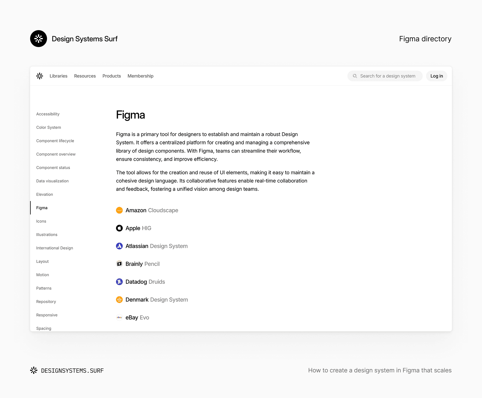
External references can also help at this stage. The Design Systems Surf Figma directory collects public Figma files and community resources from established design teams like Amazon, Atlassian, GitHub, IBM, Microsoft, Shopify and Salesforce. Use them to study best practices for organizing foundations, design tokens and system documentation, rather than copying them outright.
Your audit should result in a clear list of repeated decisions, conflicts and missing pieces. If your forms use four slightly different spacing values and three versions of the same input field, that shows you exactly what needs fixing first. These ambiguities confuse human designers today and cause AI tools to guess incorrectly later. This evidence becomes the basis for the foundation layer.
Build the system foundations
Foundations turn your audit into shared visual and behavioral rules. They give components a predictable structure, reduce micro-decisions and create clearer context for designers, developers and AI-assisted workflows.
Build the foundation layer before components
The foundation layer usually covers color, typography, spacing, layout, radius, elevation, borders and motion. You don't need to flesh out all eight areas right away, but your most frequent decisions should be clear before you expand your component library.
Typography shows why foundations need more than just reusable styles. A good type system needs semantic roles, hierarchy rules, readability guidance, responsive behavior and a direct link to code. The Typography Foundation offers a clear, structured example of how these layers work together across Figma files and system documentation.

Picture a simple button component. It relies on color roles for default, hover, disabled and destructive states. It uses typography for labels, spacing for padding, corner radius for shape, borders for focus states, and motion for interaction feedback. If these foundational rules are unclear, each component has to solve them independently.
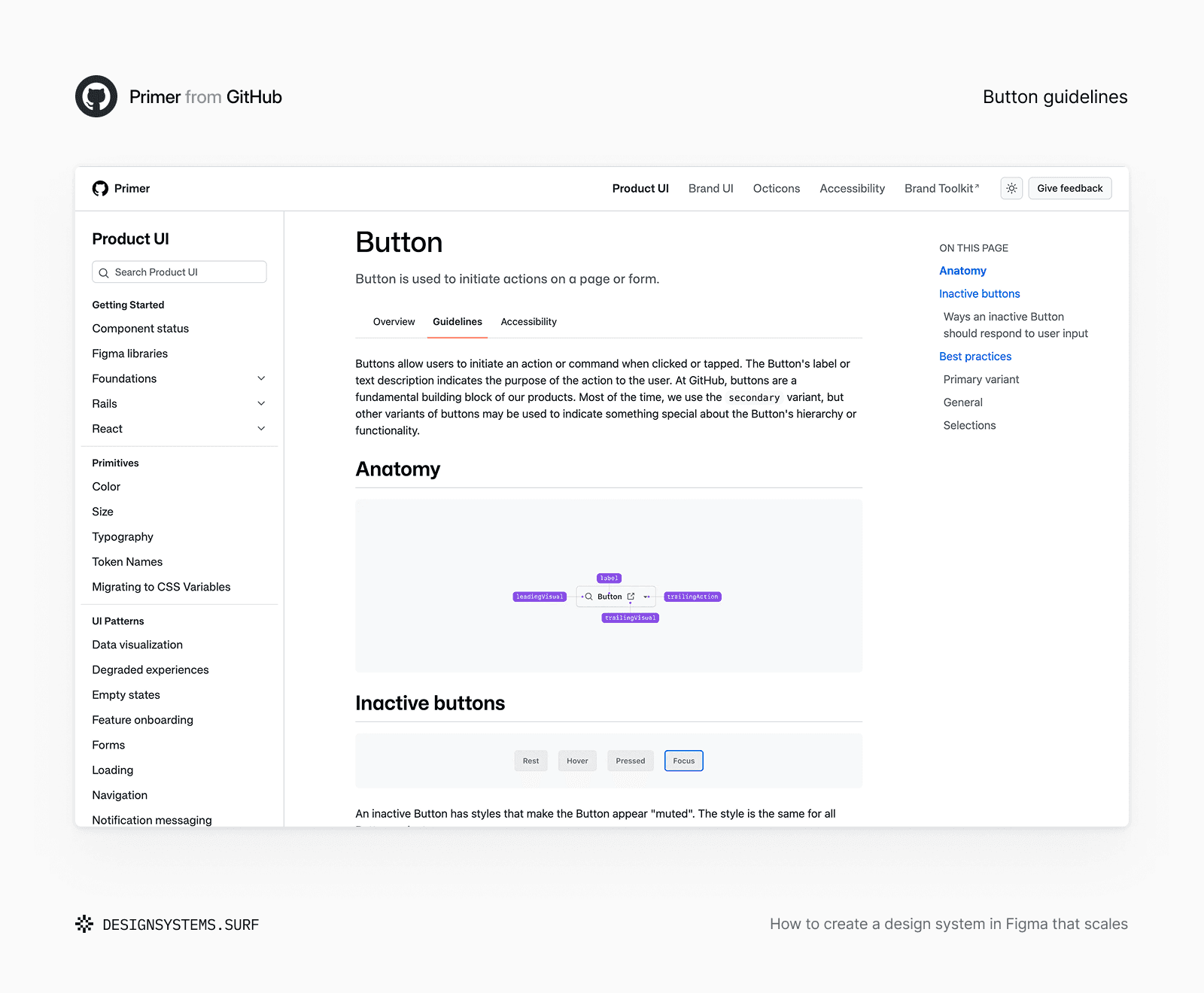
This is how small inconsistencies creep in. One component uses 12 pixels of horizontal padding, another gets 14 and a third introduces a new value because neither felt right. These one-off choices seem harmless, but they make your library much harder to manage, scale, and connect to downstream automation.
You don't have to complete every single foundation before creating UI elements. Just build enough structure to support your first product surface. A team working on forms might start with typography roles, spacing, input borders, focus states and feedback colors. A dashboard team will need tighter rules for density, layout, elevation and data hierarchy.
Most component bugs and inconsistencies trace back to gaps in the foundational layer. When you set up a strong foundation layer, every component you build after rests on a stable base.
Turn foundation decisions into variables and tokens
Once the foundation decisions are clear, structure them so they can be reused consistently. In Figma, variables can hold values and relationships, while design tokens provide the broader naming and semantic model that connects those values across tools.
A primitive like blue-600 describes a raw palette value. A semantic token like action-primary-background describes how that value is used. The semantic token points to the primitive instead of repeating the color directly.
A simple, practical token structure usually separates raw values from product meaning.
This separation makes updates much easier. You can change your primary action color from one shade of blue to another without editing every button, link and control manually. It also makes intent clear: a designer or AI tool can pick the exact semantic role required by the interface rather than choosing a color based purely on appearance.
Don't turn every single value into a token just because it shows up in a design file. Tokenization works best when a value repeats, shares a clear meaning, changes across modes or keeps design and code in sync. A one-off illustration detail does not need the same system status as a surface, text, spacing or interaction choice.
Name your tokens based on stable meaning wherever possible. Brand values and implementation details can change over time, but semantic roles like text-secondary, surface-raised or space-component-gap stay consistent. Aliases and modes can then adapt those roles to themes, platforms or product contexts without changing their core purpose.
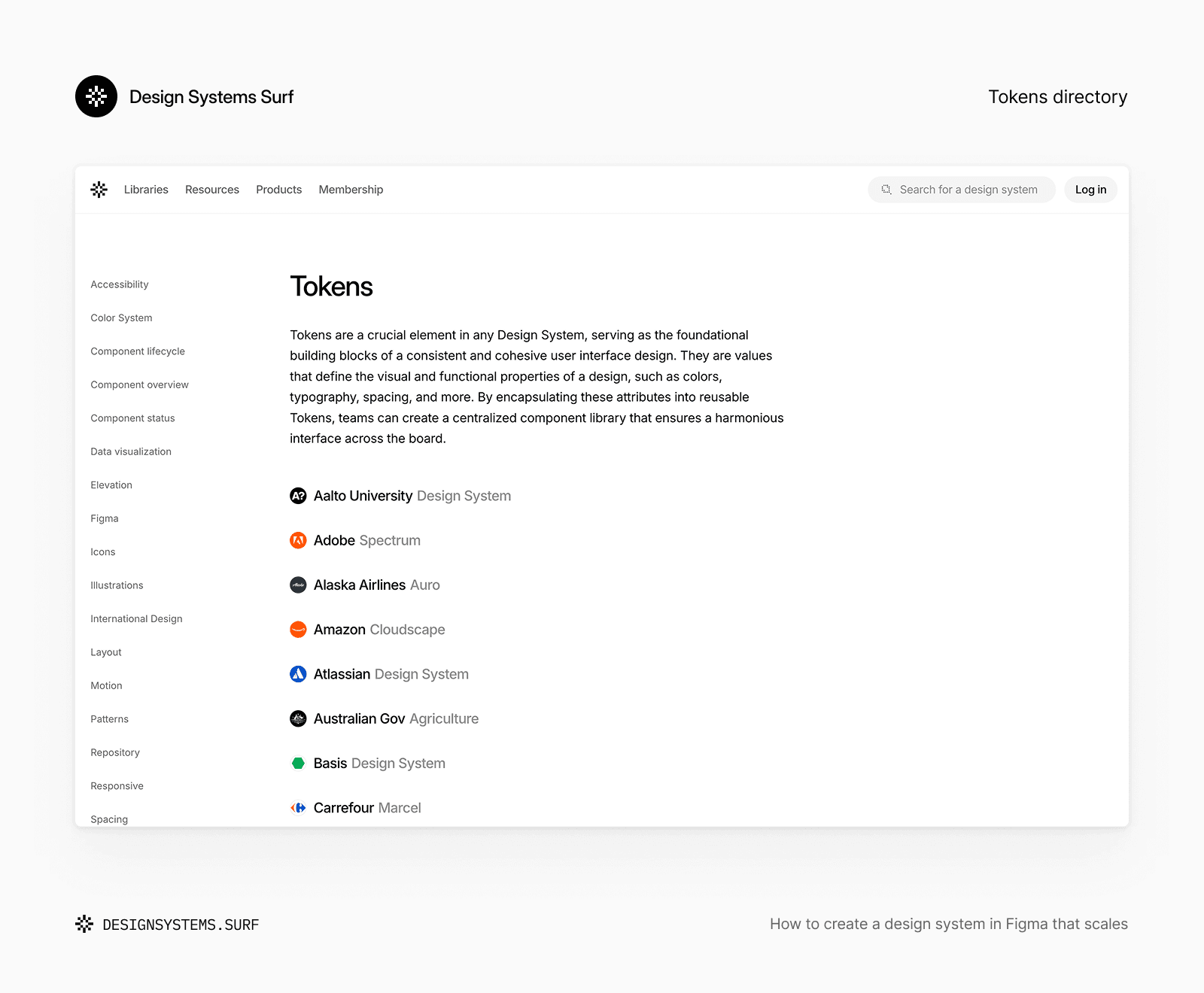
You can check the Design Systems Surf tokens directory to see how established design systems document token structure, naming, roles and relationships. Just like with public Figma libraries, these resources are best used to study different models rather than copying a structure without adapting it to your product documentation.
Focus on creating a token model that is easy to understand before it gets too large. That model gives your components a predictable set of decisions to build from.
Create components around product needs
With foundations and design tokens set up, you can move from basic styles to actual interface behavior. Your components should solve real product needs, not come from a generic UI kit checklist. The same rule applies when using AI tools to generate or suggest UI: approved components only help if their purpose and limits are clear.
Create components from recurring product needs
Start with patterns that show up constantly across your target product area. Say a product flow requires a basic input field. Before creating variants, define what the component needs to do. It might need a label, helper text, validation feedback, a required indicator, icon slots and states for focus, error, disabled and read-only behavior. These requirements should come from real screens and forms, not an abstract canvas.
A component deserves a spot in the system when it solves a recurring problem, has a clear purpose and benefits from shared management.
Next, define the component anatomy, properties, states and accessibility expectations. Always test it inside a realistic screen before you build out dozens of variants. A component might look perfect on its own, but break as soon as text wraps, error messages get longer, fields get grouped together or the layout shrinks.
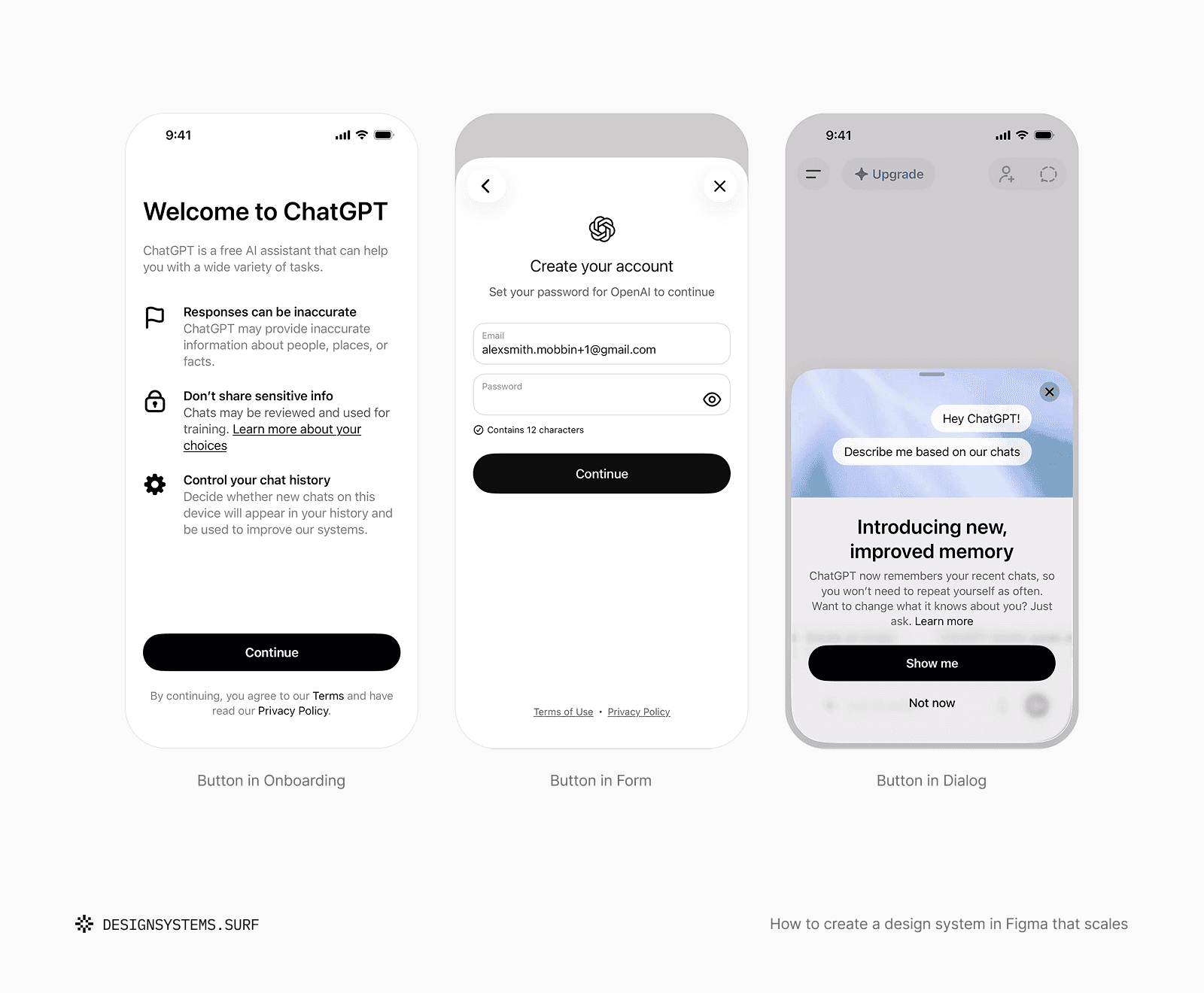
The same rule applies to buttons, cards, navigation and tables. Property names like Primary, Secondary, Small and Large describe appearance, but they don't explain when or why a designer should use them.
Building from real needs also keeps the first release manageable. A small set of well-tested, high-use components creates far more value than a massive library full of untested edge cases.
Define states, variants and composition rules
A component isn't finished just because its default appearance looks good. It also needs a clear structure for variations and dynamic behavior.
Use component variants for intentional, supported alternatives rather than every possible design combination. Figma component properties can toggle content, optional elements or layout adjustments without blowing up your file into a matrix of nearly identical variants. Every option you offer should represent a clear design decision your team is prepared to maintain long-term.
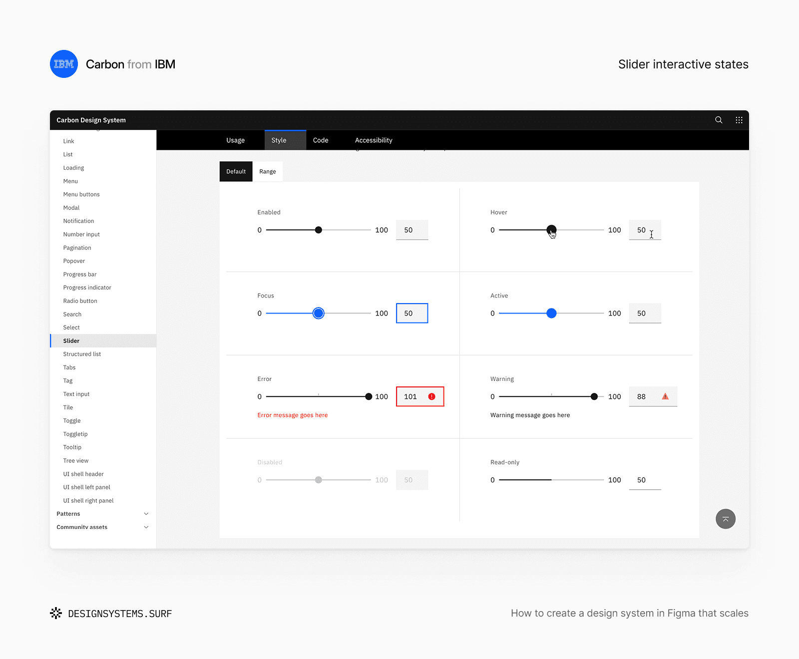
Component states need the same care. Default, hover, focus, active, disabled, loading, selected, error and empty states don't apply to every single UI element, but you should define all necessary states before a component goes into production.
Make limits and unsupported combinations explicit as well. Clear boundaries help designers, developers and AI tools distinguish between a supported pattern and an unapproved variation.
Connect the system beyond Figma
A design system works best when its rules extend beyond Figma itself. Your codebase, documentation and actual UI should share the exact same logic instead of creating parallel, conflicting versions of the system. This connected context is also what makes your design decisions truly AI-ready.
Document the decisions, not only the assets
For a component, explain its core purpose, where it should or should not be used, supported states, content rules and whether it is current, experimental or deprecated. For a foundation or design token, document its semantic role, relationships, accessibility rules and any exceptions that affect use.
Good documentation helps team members choose and apply assets correctly.
Color is a prime example of why this context matters. A raw palette alone cannot explain semantic roles, state behavior, contrast requirements, theme changes or code implementation rules. The Color Foundation shows how to group these decisions around one color model instead of being maintained as separate fragments.

Some guidelines belong directly inside Figma. Clear layer names, component descriptions, canvas annotations, visual examples and dedicated documentation pages bring rules closer to where design happens. Other details, like developer notes, migration guides, deep accessibility checks, release history and contribution processes, are usually easier to manage in external tools.
Avoid repeating the exact same rule across multiple places without establishing a single source of truth. When a Figma library update happens without updating written guidelines, you end up with two competing versions of the system. So when teams ask, “How do I maintain a design system in Figma?”, keeping documentation synchronized is step one. Otherwise, AI tools connected to both sources inherit that exact same conflict.
If you need a structured starting point to set up your system, Design Systems Surf Foundation products combine Figma files with setup guides, accessibility standards, AI context and developer handoff processes. The real value is not just the Figma file itself, but the connected logic built around every decision.
Align Figma with code before the system grows
Compare token roles, component names, properties, states and behavior while the system is still small. A Figma button may use Intent = Danger while the code component uses variant = "destructive". The string values differ, but the mapping remains clear. Issues start when the design property maps to multiple code behaviors, or when both sides use the same name for different meanings.
Design and code don't need identical internal structures, but they must express the same decisions.
Create a simple record of these design-to-code mappings. Define which design tokens match code variables, which Figma components map to implementation components and where platform-specific differences are intentional. This integration makes developer handoff far more predictable and gives teams and AI tools a shared source of truth as the system grows.
Don't wait until your Figma library feels complete. By then, inconsistent naming and structure may have spread across dozens of files and repositories. Early alignment proves whether your system works outside Figma and saves you from costly migration work later.
Prepare the system for people, code and AI
Giving an AI tool access to a Figma file doesn't automatically give it the context behind the design. It sees components, Figma variables and examples without knowing which options are current, which roles are semantic, which combinations are invalid or which source wins when design and code conflict.
Once system decisions are clear across design and code, they become far easier for AI tools to work with.
To learn how to automate design system updates in Figma using modern workflows, you need explicit system context. That includes system scope, token roles, naming rules, component guidelines, supported states, accessibility constraints, code mappings, deprecated elements and the current source of truth. The goal is to make your existing design system clear enough so AI tools don't have to guess logic based on visual appearance.
This is also a great quality test for your design system. If a rule can't be explained clearly to a new designer, developer or AI assistant, that decision still relies on unwritten team memory.
AI-ready doesn't mean your library is AI-generated. It means your system contains enough clear context for people, code and AI to execute the exact same product logic.
Test, publish and improve the first version
Your initial release doesn't need to cover your entire product surface. It just needs to work in a real product context, clearly communicate its limits and provide a stable baseline for future iteration.
Test the system in a real product flow
Pick one representative user flow and build or refine it using your system. Sign-in, checkout, account settings, table filtering or form submission work great because they test foundations, components, states, content rules and layout choices all in one place.
Look for friction points where your library stops helping. The flow might still rely on raw values, local overrides, unapproved component combinations or duplicated patterns. Long labels might break your expected layout, while loading and error states might reveal missing color, spacing or interaction rules. A component that looks flexible on its documentation page might prove frustrating to compose inside an actual screen.
Compare your Figma designs with code as well. Verify whether the exact same design tokens and components exist in implementation, check whether states behave as expected and confirm whether any design variations can't be supported reliably. Focus on identifying which decisions need refining before you publish, then repeat that test as your system expands.
Publish a usable first version
A practical first version may include core foundation decisions, a simple design token structure, a small set of high-use components, their necessary states, basic usage guidance, initial design-to-code mappings and one fully tested product flow. The exact contents will vary, but your supported scope and known limits should be crystal clear.
Publish your system when it is useful enough to support its defined scope, not when every possible asset has been created.
Organize your Figma file so current assets are easy to find. Separate documentation, working areas and archived material. Use consistent naming patterns and include concise release notes whenever you publish updates to your library. Publishing makes assets available, but clear communication explains what changed and whether product teams need to take action.
Frame your initial release as a starting point that grows with ongoing product usage. Add new rules and components only when repeated product evidence justifies them. This keeps the system manageable and ensures the context used by designers, developers and AI tools stays up to date as your design system evolves.
Common mistakes when creating a design system in Figma
Many Figma design systems become frustrating to use because teams scale their library before core decisions are stable.
Starting with a large component catalog. Creating a huge catalog upfront feels like fast progress, but it standardizes assumptions before you test real product needs. Start with a bounded surface area and prove your model in actual usage.
Copying another company’s system too literally. Public Figma design system examples offer helpful reference points, but their visual density, naming, accessibility rules, platforms and workflows rarely match your specific product goals.
Creating variables without semantic roles. A structured palette is helpful, but you still need explicit semantic roles for text, surfaces, borders, actions and states.
Tokenizing every single value. Adding more tokens does not automatically improve consistency. Every token in your library needs a clear reason to exist, be shared and be maintained.
Adding variants for every tiny difference. Oversized variant matrices make components harder to use. Focus on a lean set of supported decisions and clear composition rules.
Leaving documentation until the end. Names, descriptions, usage examples and code mappings belong in the core system model. Writing documentation early exposes flawed logic before it spreads.
Ignoring code until the library feels finished. A design system that exists only in Figma will likely prove costly or impossible to implement as designed.
Treating publication as completion. Once you publish your library, it still requires active ownership, user feedback, regular updates, migration guidance and continuous testing.
What to do next
The best way to build a design system in Figma is to start with the smallest setup that protects real product decisions. Define the scope, audit the interface, establish the foundations, structure the tokens, build components from repeated needs, and test them in a real flow.
From there, let real product evidence drive your expansion. Grow your system as your product demands broader support, keeping your library focused on actual utility over artificial completeness.
For a wider perspective across Define, Create, Adopt, and Evolve, use the AI-Ready Design System Roadmap. You can also read AI-ready design systems: how to build a system that works for people, code, and AI to see how this explicit context powers AI workflows.
The Design Systems Surf Pro provides all Foundation products and ongoing resources, giving teams a solid, maintained starting point so they don't have to make every layer from scratch.

Frequently asked questions
These questions cover common decisions around setting up, publishing, and maintaining a design system in Figma.
Can you build or generate a Figma design system using AI tools like Claude?
AI models like Claude excel at generating design token JSON files, drafting component documentation and writing automation scripts through the Figma API. Teams achieve the best results by using AI to accelerate repetitive file setup while keeping core architecture, visual density and business logic human-led.
Are automated Figma design system generators worth using?
Design system generators effectively accelerate early setup by producing starter color scales, typography stacks and atomic components for rapid prototyping or simple admin tools. Complex enterprise products usually require human oversight and custom tailoring to match specific codebase constraints and accessibility standards.
How can you automate design system updates between Figma and code?
You can automate token workflows by connecting Figma Variables to GitHub repositories using tools like Tokens Studio, Style Dictionary or custom Figma API integrations. When a designer updates a variable in Figma, automated pipelines transform those updates into code tokens (CSS, Tailwind or JSON) without manual developer handoff.
How do you handle major library updates without breaking product files?
Avoid pushing destructive updates directly to active components. Use deprecation flags, publish revisions in separate branches or release major component shifts under new names. Always include change logs in release notes and run migration passes with product teams before archiving legacy elements.
How do you measure design system adoption in Figma?
Track library analytics directly in Figma to evaluate component usage counts, detached instances and active file adoption. Combine these quantitative metrics with developer feedback and time-to-market speed to measure how effectively teams reuse system decisions.

