AI-ready design systems: how to build a system that works for people, code, and AI
22 min read
Most design systems already contain the assets AI needs. What they often lack is the context that explains which decisions are current, approved, and safe to reuse.

Founder of Design Systems Surf

A system becomes AI-ready when its logic is explicit and connected across documentation, semantic naming, governance, and design-to-code mappings. Designers and developers can fill gaps from experience, remembering which components, tokens, and patterns are current. AI cannot, so when those decisions are missing, it has to infer them.
Reusable assets remain the foundation, but people, code, and AI must be able to follow the same decisions without relying on hidden team knowledge.
As Figma AI, MCP, and engineering agents become part of everyday product development, that shared logic must also be structured for AI. This article explains what makes a design system AI-ready and how to create one source of truth for people, code, and AI.



PRO
Your design system works for people. That doesn’t mean it works for AI
Most design systems survive because people are good at interpreting missing context. Designers open a Figma library and instinctively know which component is safe to use based on the last design critique. Developers may avoid a broken prop because they remember how it behaved in production. Designers may know which of two similar layouts is outdated, even when both remain in the library. That’s tribal knowledge, not a system.
Good teamwork can mask a weak system. If your system relies on human intuition to survive, it’s not ready for automation.
Consider a typical scenario inside a standard AI UI component library. A team has three card variations in their Figma file: Card, ContentCard and PanelCard. They look nearly identical, but the team knows the history: Card is the current standard, ContentCard is a legacy asset for marketing pages and PanelCard is reserved strictly for internal admin tools. To a human, this context is obvious. To AI, these are simply three equally valid options.
When you deploy some of the top AI tools for component library generation or ask an LLM agent to build a new settings page, it has to guess. It does this because the system fails to state clearly which option is current, supported or contextually correct.
AI isn’t inherently bad at design systems. We’re just asking models to intuit unwritten norms that humans learned through hands-on experience. True AI readiness begins when that hidden logic becomes explicit. The system should clearly explain which components are current or legacy, which contexts they support, which variants are allowed, which examples are safe to reuse, and which decisions require review before they become part of the system.
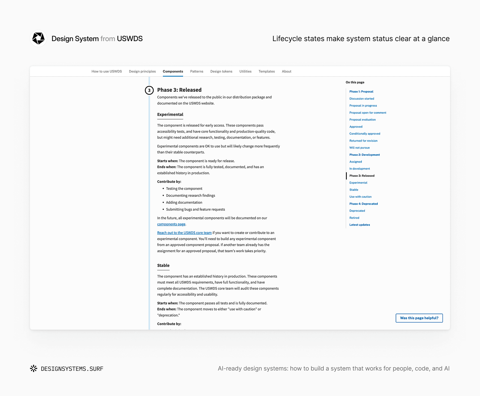
For example, USWDS makes component readiness explicit through a lifecycle that moves from proposal and development into experimental, stable, use-with-caution, deprecated and retired states. Each phase explains how confidently a component can be used and what support it receives. The component doesn't depend on team memory to explain whether it is evolving, production-ready, unsupported or leaving the system.
Design systems built on unwritten rules don't translate well to AI. Before expanding your component library, document the decision-making logic behind it.
Every missing decision becomes an AI guess
When a design system decision is unclear, AI still has to complete the task. It has to give you something.
Most AI-assisted workflows are designed to produce an output. Unless uncertainty is made explicit, the tool may infer a rule instead of stopping for clarification.
If the system doesn’t clearly explain the decision, AI will simply infer one instead.
That inference might look reasonable or even correct at first glance. The real risk appears when that same unsupported guess gets repeated across dozens of generated screens, implementation suggestions and team workflows.
Unclear token roles can make AI choose values by visual similarity, causing semantic color use to become inconsistent. A typography scale without usage rules may lead AI to apply sizes by visual hierarchy alone, while incomplete component states leave error, loading, empty, focus and edge cases inconsistent.
The same problem appears when Foundation rules live in team memory, similar components solve the same need, or design and code use different names. AI may apply raw values without product context, select either component based on nearby examples, or map Figma properties to the wrong code props. Outdated documentation creates the same risk by allowing deprecated decisions to continue spreading.
The pattern is identical in every single case. The design system contains visual assets, but the meaning around those assets is incomplete.
A color token represents surface hierarchy, content priority, interaction states, accessibility contrast or product context. If a team uses an AI tool to auto-generate design tokens but only exposes raw values, the AI will naturally treat completely distinct options as interchangeable.
A typography scale follows the same logic. It carries critical decisions about reading rhythm, density, information hierarchy and responsive behavior. Without usage rules, AI may produce something that looks polished while weakening the system underneath. Color Foundation connects palette values to semantic roles, surfaces, states, modes, contrast requirements and developer handoff.
Typography Foundation connects the visible type scale to semantic hierarchy, responsive use, readability, accessibility, and implementation guidance. In both cases, the reusable values are only one part of the product; the surrounding rules explain what those values are supposed to do.


A component is no different. It is far more than a reusable frame or a coded module. It must include purpose, anatomy, props, variants, states, behavior and unsupported use cases. If you don’t make those decisions obvious, the AI will reuse the file while missing the point of your system.
Tokens need semantic roles, clear references, naming conventions, modes and usage boundaries. Documentation must be current, findable, specific and connected directly to the actual source of truth.
For example, a team may have gray-500, text-secondary and border-muted. A designer knows that gray-500 is a primitive, text-secondary is for low-emphasis content and border-muted is only for structural separation. If AI only sees examples where all three look visually similar, it can select the wrong token. The interface may still look acceptable, but the mistake is semantic, not visual.
AI increases the cost of unclear system logic. A human designer might make that mistake once and catch it in review. An AI-assisted workflow can repeat it faster, across more surfaces and with total confidence.
AI-ready design systems define the rules before a tool creates an output. Usage rules and code mappings reduce guesswork and prevent unwritten habits from hardening into permanent tech debt.
AI-ready doesn’t mean AI-generated
Many teams judge an AI-ready design system based purely on its raw output. When you connect Figma to an automation workflow, engineers can generate React components and designers can quickly spin up initial layouts. The layout feels clean, the component naming seems reasonable and the generated code looks close to the intended interface.
But raw generation is completely different from system-aware output.
For example, an AI might create a payment settings page complete with a card layout, form fields, a primary button and an alert banner. Visually, everything looks correct and follows standard UX patterns.
The real test is whether the interface follows your design rules:
Is it using the current card component or an old one?
Does the alert follow the approved severity model?
Do the form fields include valid states and error behavior?
Does the primary button map to the correct code component?
Does the typography follow the system hierarchy?
Does the spacing reflect the right density for payment workflows?
Without explicit design logic, AI will generate UI that looks convincing but breaks under the hood.
AI-ready should not mean “AI can generate screens from our files.” It should mean “AI can understand and apply the same system decisions our team expects people and code to follow.”
AI can support bounded tasks such as drafting documentation, identifying inconsistencies and preparing implementation notes. Governance decisions should remain human-owned. AI shouldn’t decide which components are active, which accessibility requirements must be preserved, or how the system should be structured.
Keep the source of truth in your actual system. Tokens, docs, code and review guidelines have to hold the line. AI is useful when it works within those guardrails, but it shouldn’t be inventing them.
An AI-generated design system starts with generation. An AI-ready design system starts with clarity.
Adding AI to messy files won’t magically fix your outputs. Clear docs and solid structures keep automated workflows safe and reliable. Connecting the AI tool is only the first step. The next question is what context the tool receives when it gets there.
Give AI system context
Once you realize that AI-ready doesn’t mean AI-generated, the next mistake is easy to make. Teams often assume that giving an AI tool access to files is the same as helping it understand the system.
You might connect AI to Figma, Storybook, documentation, token files or code. New agent-based workflows and protocols like MCP make this access even more powerful. AI can now look at components, read design tokens and write code from your existing assets. This is useful, but access alone doesn’t explain what your system actually means.
For example, imagine an AI agent can see a button component in Figma and Storybook. It can inspect variants, props, labels and examples. It can see primary, secondary, danger, loading and disabled.
But it still cannot answer your team’s real design questions:
When should
dangerbe used instead ofprimary?Is
loadingallowed on destructive actions?Which button style is deprecated?
Which props are supported in code but not exposed in design?
Which usage examples are current and which ones are old?
Which accessibility behavior must never change?
Without that context, AI has the asset but still has to guess the rule.
This is why MCP is helpful, but it isn’t a complete fix. Model Context Protocol can help AI tools reach the right system sources. But if those are incomplete, outdated, poorly named or disconnected, the AI just inherits the same confusion your team deals with every day.
A useful context layer explains decisions instead of just opening up files.
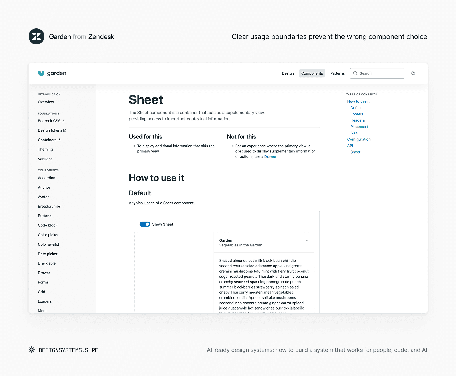
Zendesk Garden shows how guidance and implementation can describe the same component decision. Its Sheet documentation combines purpose, usage boundaries, interactive examples, configuration, API structure and accessibility behavior. The component isn’t only available in code: the surrounding guidance explains when to choose it, when to use a Drawer instead and which structure and focus behavior the implementation must preserve.
For design tokens, this means structured JSON data with clear names, references and semantic roles. Component guidance needs clear Markdown files that detail purpose, approved variants, accessibility rules and bad use cases. For design-code parity, you need clean mappings between Figma properties and code props.
Across Foundation products, the AI context .md explains purpose, naming logic, usage rules, constraints and assumptions that cannot be recovered reliably from the Figma file alone. Accessibility guidance preserves foundation-specific limits, while developer handoff explains how the same decisions should move into implementation without being reinterpreted.


The format matters, but the structure matters more. You need clean data for machines, clear language for AI and one shared source of truth to keep people aligned whenever things change.
A Figma file can show what exists. Storybook can show how components behave. Documentation can explain how teams should use them. Token files store the raw values, while governance defines what is approved, deprecated, experimental or under review.
Don’t just give AI access to your design system. Make sure it understands the decisions behind it and how those decisions connect across every source.
AI-ready work links these pieces together. This stops AI from treating your files like disconnected clues or copying surface-level visuals. Stop throwing more files at the tool. Give it less room to guess.
Why reusable assets are not enough anymore
Traditional design systems focus on reuse. If teams were creating the same buttons, colors, form fields, layouts and patterns again and again, the first job of a design system was to turn repeated interface decisions into shared assets. Tokens, components, and code let teams reuse established decisions instead of starting from zero.
But AI changes what “usable” means.
Human teams often compensate for missing context through shared memory and experience. AI cannot rely on team memory.
For example, a standard spacing scale may include space-100, space-200, space-300, and space-400. The scale is reusable, but it does not explain how each value should be applied.
Your team might know that dense data tables need compact spacing and payment forms need more breathing room, but keeping that rule in human memory creates a blind spot. Without clear rules, AI looks at raw values and guesses the spacing based on visual similarity. It doesn’t understand why the gap is there; it just tries to copy the look.
AI needs more than reusable assets. It needs usable context that explains where values belong, why they exist and how they should be applied.
An AI-ready spacing system leaves no room for guessing. You have to document the logic: where compact density makes sense, where to use generous padding, how breakpoints affect the layout, and which quick fixes or local overrides will break the build.
Spacing Foundation connects scale values to grouping, density, hierarchy, layout context, usage boundaries, and developer handoff. The numeric scale remains reusable, but the surrounding guidance explains why the same values should be applied differently across dense tables, customer-facing forms, responsive layouts and other product contexts.
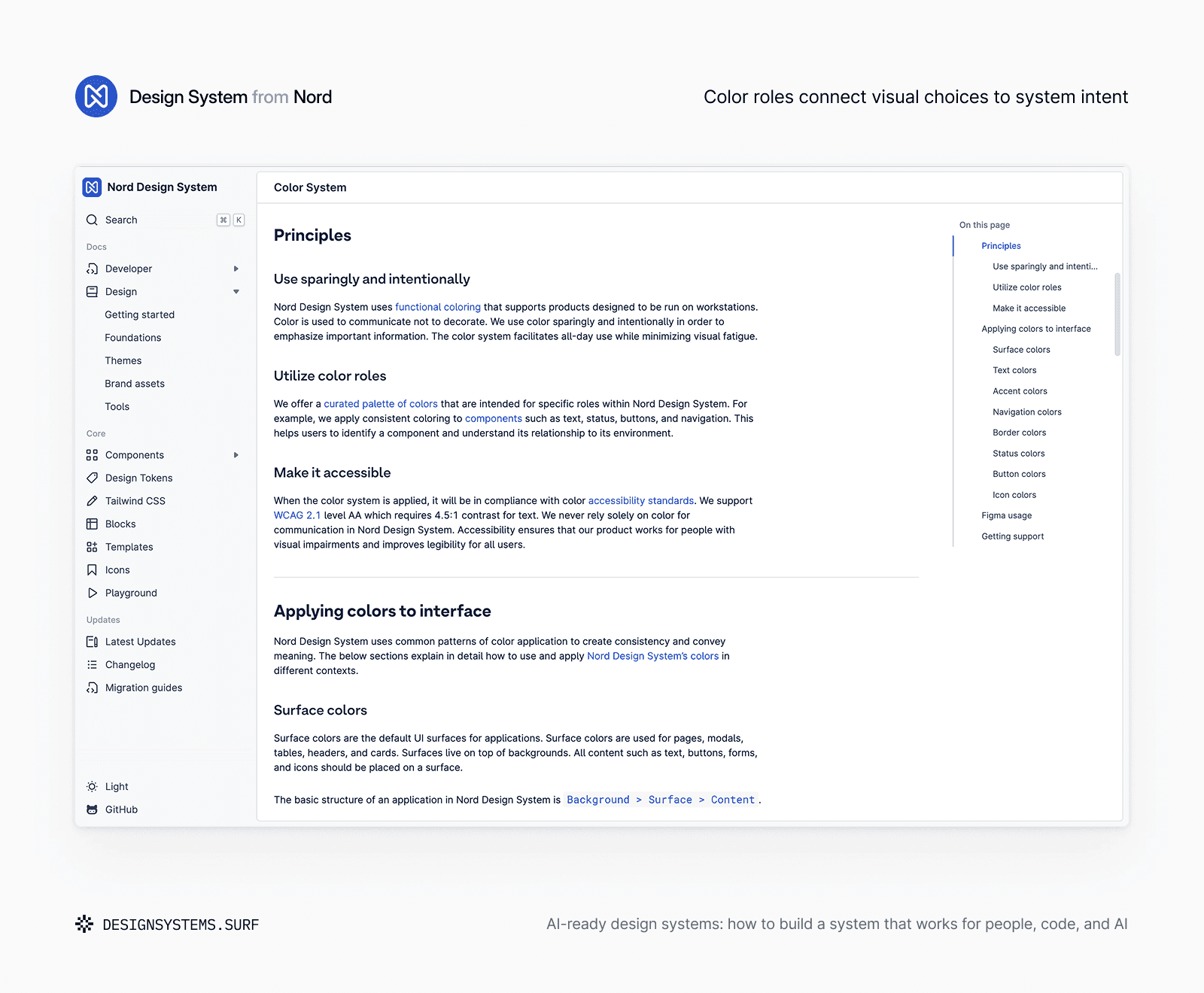
Nord Design System applies this shift through a color system organized around functional roles rather than decoration. Its guidance connects color to interface purposes such as surfaces, text hierarchy, status, navigation, borders and buttons, while also requiring accessible contrast and avoiding color-only communication. The palette becomes reusable because its intended meaning and constraints travel with it.
The same pattern applies to every part of your design system. A color palette becomes usable system context when it defines surfaces, states, roles, contrast and constraints. A component becomes usable system context when it explains purpose, supported variants, states, accessibility behavior and unsupported combinations. Documentation only works as real context when it’s kept up to date and points to a single, shared truth. If it’s stale, it’s useless.
This is the real maturity shift. Honestly, counting components is a terrible way to measure a design system. What actually matters is how much context and meaning those parts carry when they move between design, code, docs and automation.
AI-ready design systems don’t get rid of reusable assets. They make those assets much easier to understand, safer to apply and harder to misuse at scale.
What AI needs to know before it can help
AI struggles with ambiguity, not imperfection. Teams often treat AI-readiness as a technical integration: connect the tool, expose the files, and expect better output. In practice, AI encounters many of the same ambiguities that affect designers and engineers. The harder work is making the underlying decisions explicit.
Document the core logic, and the system becomes actionable. AI needs context across four main areas.
Direction means understanding the system’s purpose. AI needs to know which products the system supports, what is in scope, and which trade-offs matter. Otherwise, it may fall back on generic best practices.
Structural choices explain how the system works. This includes tokens, component states, properties, variants, and design-to-code mappings. Without this context, AI may copy visual patterns without preserving the logic behind them.
Adoption context shows what teams should use now. AI needs to distinguish current standards from drafts, outdated components, and unsupported guidance.
Maintenance signals show where the system is going. AI should know what is being updated, deprecated, or retired so it does not continue recommending patterns the team is moving away from.
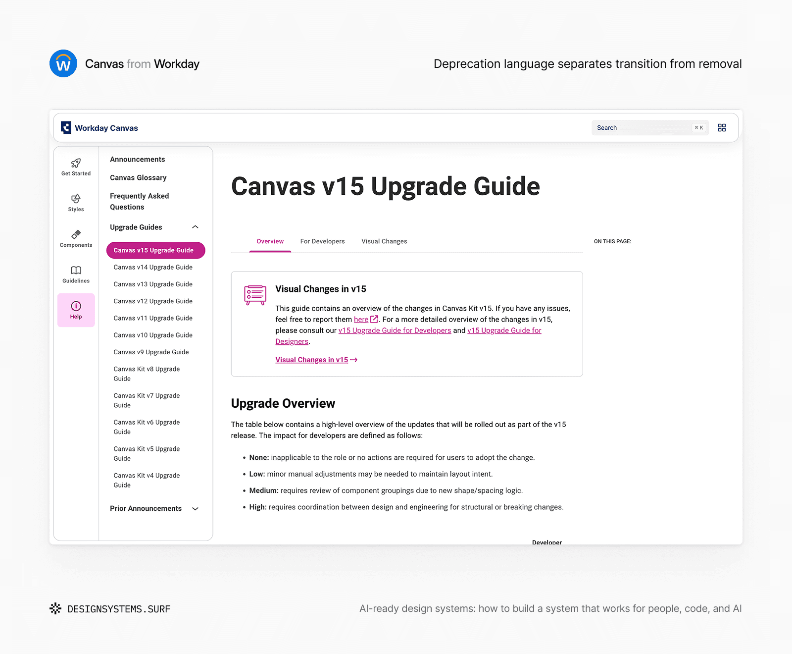
Workday Canvas makes maintenance intent explicit through its upgrade guidance. Deprecated code remains available but receives an explicit marker that directs consumers toward a more stable alternative. Removal means the code is no longer available and teams must follow the documented migration path. The system distinguishes what still works, what should no longer be adopted, and what requires active migration.
The task sounds simple, but reliable output requires far more than just a component library. The tool needs to know the product scope, token roles, component behaviors and code mappings.
You don’t need enterprise-grade governance before you start using AI. You just need to provide enough explicit context so the tool doesn’t guess important system logic.
A simple rule to follow is this: AI should never invent your system logic. It should simply execute the logic your team has already made clear.
Where AI is going to guess first (and how to stop it)
You don’t need to inspect every part of your design system at the same depth before using AI. Start with the areas where AI is most likely to make a plausible but unsupported decision.
Don't measure a design system by its component count. Use a checklist to pinpoint where unwritten rules create friction. Start with the areas where AI is most likely to make plausible but unsupported decisions.
Meaning and structure are the first risk. Unclear token roles can make AI choose values by visual similarity, while weak Foundation logic removes the product context behind color, spacing, and typography. Hardcoded values create another problem because one-off decisions from existing screens may appear to be approved system choices.
Assets and behavior create a second group of risks. Duplicate components give AI several valid-looking options, increasing the chance that it selects an outdated component, combines patterns, or introduces another variation. Incomplete states also leave behavior open to interpretation, causing AI to miss error, empty, loading, focus, disabled, or edge cases.
Sources and governance determine what AI trusts. Design-code drift can lead to incorrect mappings between Figma and code, while outdated documentation and an unclear source of truth make old or conflicting guidance appear current. Weak ownership and review rules add another risk: AI may suggest changes that bypass decision rights or exceed the team’s capacity to maintain them.
For example, a messy system may have a current button in code, an older button in Figma and documentation that still shows both. A designer knows which one the team prefers. A developer knows which one is production-ready. AI will view all three sources as equally valid. That is a context problem.
A practical first pass is simple: pick one product flow, one foundation area, one component family and one documentation page. Then ask: Where would AI have to guess?
Think of this checklist as a way to catch your biggest blind spots before AI starts multiplying them across your product. When AI helps you write code, generate screens or draft documentation, it needs to know which rules matter and which gaps require human review. The answer usually shows you exactly what to fix next, and it’s far more useful than a generic maturity score.
You don’t need to fix everything at once
After a checklist like this, the natural reaction is to see too many problems at once. Your tokens might not be fully semantic, your components might overlap, documentation may lag behind the current system, and design and code don’t always match. Your system isn’t broken. You just have unwritten rules that need to be made visible.
AI-ready doesn’t require a perfect, enterprise-mature design system. A better baseline is simple: can AI apply your important design decisions to the specific task you want it to do?
If your team wants AI to generate internal admin screens, focus on layout density, table patterns, form behavior, button hierarchies, status colors, empty states and the authoritative source of truth. For implementation notes, it needs design-code mappings, props, state behaviors and exceptions. For documentation, it needs current rules, what not to do and concrete examples.
Different workflows expose different gaps. A messy system doesn’t need a flawless master plan to improve. You need to separate the critical gaps from the minor flaws you can ignore for now.
The best approach is to pick a narrow slice: one product flow, one foundation area, one component family and one doc page. Border Foundation can help clarify separation, dividers, input states and focus treatment without rebuilding the visual system. Layout Foundation can connect grids, containers, breakpoints and reflow without turning the task into a complete system rebuild.
Then ask what decisions AI needs to preserve, which rules are missing or outdated, which source it should trust, what it should flag instead of guessing, and who reviews the output before it becomes system behavior.
This shifts AI-readiness from a vague maturity goal into a focused system improvement practice. You don’t have to fix everything overnight. Just stop the guesswork where AI mistakes hurt the most.
Use the AI-ready Design System Roadmap to assess your system
AI-ready design systems need explicit decisions, connected context, current sources of truth and rules that people, code and AI can all follow. AI-ready Design System Roadmap helps you audit these areas, find critical gaps and decide what to do next.

Use the Roadmap to see where AI is likely to guess and choose the next 3–5 priorities without relying on rigid checklists or generic scores.
Clarity over completeness
Automation or larger libraries won’t save a design system built on vague rules. Governance beats volume every time.
AI makes this visible because it lacks the informal knowledge that helps human teams survive. It can’t read team memory, history, old Slack threads or shared intuition. This doesn’t mean AI is breaking the system. It means we have a new type of user to design for.
If designers, developers and AI tools all need to follow the same rules, those decisions must be easy to find, understand and review.
Tokens need clear meaning. Components need defined purposes. Documentation must stay current. Design and code must remain connected, and the system must show what is approved, outdated or under review.
You don’t need a perfect system. Every design system will always have gaps, exceptions and unfinished areas. More assets won’t make it AI-ready by themselves. More tools won’t either.
Build for clarity first
A system is AI-ready when its rules are clear, connected, up to date and structured so people, code and AI can all use them. The goal is not to remove every gap, but to make important decisions explicit enough that people can move faster without relying on unwritten knowledge and AI can help without guessing.
Build for that clarity first. Completeness can come later.

