Where AI starts guessing first in your design system
9 min read
Not every gap needs to disappear for a design system to become AI-ready. Important decisions need to be clear enough that AI does not turn uncertainty into repeated system behavior.

Founder of Design Systems Surf

You might have tokens, components, docs, and production code, but still leave key decisions unwritten. Human teams manage this through shared context: people remember which token to use and why an exception is still allowed. AI doesn’t have that shared memory. When docs clash or lag behind, it still has to generate something, so it picks whatever looks most plausible from the context it can access.
The biggest "guess zones" rarely look like broken components or missing tokens. They're usually valid assets that lack clear boundaries or rules.
Giving an LLM access to your Figma files or GitHub repo is the easy part. The real work is making the underlying logic explicit so AI doesn't have to guess.



PRO
AI can find the asset and still miss the meaning
Take three almost identical gray tokens: one for secondary text, another for subtle borders and a third for disabled states. Visually, they look almost indistinguishable, so any of them might look fine in a generated mockup.
An experienced designer knows they aren't interchangeable because semantic purpose trumps visual similarity every time. But if those rules aren't explicitly defined, AI will just pick whichever gray looks closest to a nearby example.
The generated screen might look clean at first glance, but the decision is wrong under the hood. The moment secondary text, structural borders, and disabled controls lose their distinct roles, your design logic starts to fall apart.
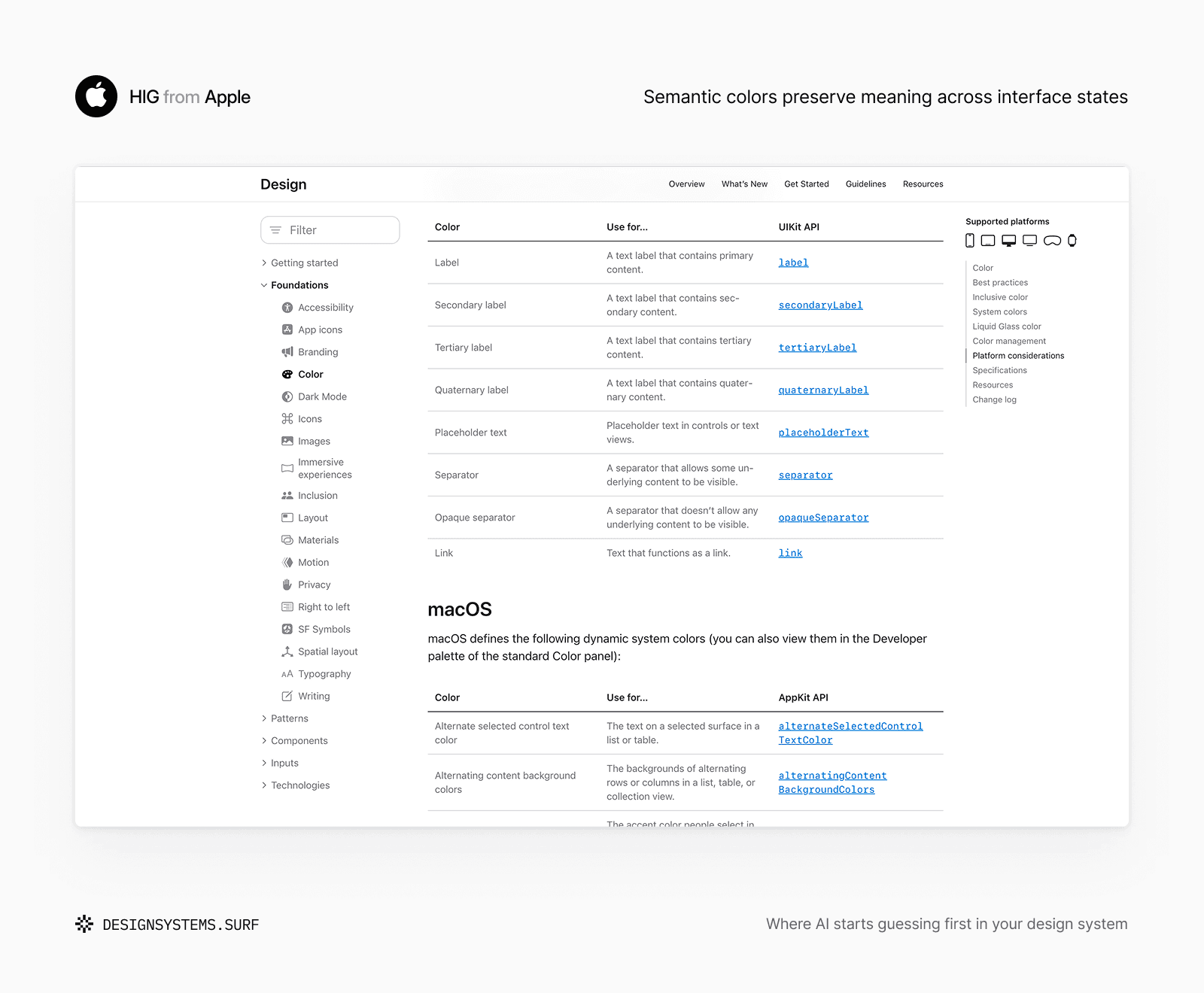
Take Apple's approach to semantic colors as a good example. Labels, links, fills, separators and backgrounds are defined by purpose rather than raw hex values. The color value itself might change across dark and light modes, but the role stays intact. That gives designers, code and AI a much stronger rulebook than just matching shades by eye.
You see the same issue with typography. A type scale gives you font sizes and line heights, but it won't tell you when to use a specific style for a page title versus a form label or helper text.
Without those explicit semantic rules, AI is forced to reconstruct hierarchy based purely on visual appearance and nearby examples.
Spacing has the exact same gap. Spacing variables show available pixel values, but they don't explain whether an 8px gap means tight grouping or responsive padding. So while AI might generate a visually clean layout, it completely misses the product context behind the spacing.
That's why raw reusable values aren't enough. Color Foundation, Typography Foundation, and Spacing Foundation need to connect raw values to semantic roles, hierarchy, accessibility rules and context that lives outside of Figma.


Components bring this issue to a whole new level. A library might have Card, Content card and Panel sitting side by side. I've watched three different designers pick three different "correct" cards in the same sprint, and all three interfaces still shipped because the team relied on tribal knowledge.
AI sees those same three options, but without clear status or context, it'll just mash patterns together or pick whatever looks closest visually. In all these cases, the right asset exists in your system. What's missing is a clear explanation of why it's the correct choice for a given situation.
An AI-ready system needs to expose clear intent, so visual similarity stops being the main decision rule.
When the system says nothing, AI still decides
What happens when a button component has a loading property, but nobody defined if it's allowed during a destructive action? Or when an alert offers multiple severity levels, but no clear boundary between warning and error?
Human teams handle these blind spots through experience. They copy a familiar pattern from another project or ping the design lead in Slack.
AI doesn't have that context, yet it still has to generate a result. It can't reliably distinguish between an approved design system rule and a generic web convention. When a state is missing, AI just invents one based on whatever patterns it saw in training. The screen might look clean and usable, but it quietly bakes in design decisions your team never actually made.
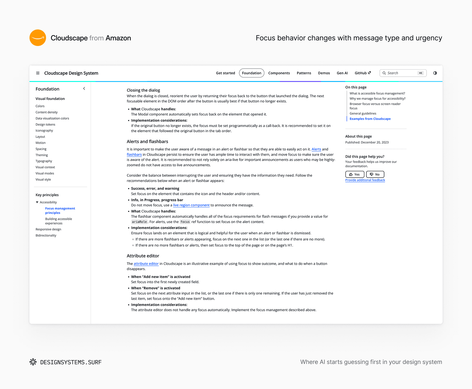
Cloudscape handles this well by documenting interaction behavior alongside visual components. Their guidelines explicitly spell out when alerts should take focus versus when a live region makes more sense. The component itself shows what exists, while the surrounding guidance dictates how it behaves. That keeps critical interaction logic intact across different flows and implementations.
Available values don’t explain allowed behavior
The same gap exists well below the component layer. Take borders and motion. You can define exact pixel widths, colors, duration tokens and easing curves, but those raw values won't tell AI when to animate an element versus when to keep an interaction immediate. Nor do they explain how to handle reduced-motion preferences or active input states.
When those boundaries aren't explicit, AI simply fills in the blanks, treating whatever is technically possible as if it's officially allowed.
For example, Border Foundation connects border values to structural roles, input states, focus treatment, and accessibility requirements. Motion Foundation connects duration and easing tokens to feedback, safe combinations, reduced-motion behavior and cases where animation should not be introduced.


In both products, constraints are treated as part of the system rather than left for AI to infer from the available options.
Lacking clear rules, AI assumes that anything technically feasible is permitted, even when the system never approved it.
Most of the time, nothing dramatic happens. You won't get a completely broken UI. Instead, you get plausible local decisions: a brand-new loading spinner, a slightly off error state or an unapproved component property.
On their own, each choice looks compatible with the system. But over time, they stack up into a parallel layer of rules built entirely on AI assumptions rather than agreed design logic.
You don't need to define every single edge case upfront to be AI-ready. What matters is drawing clear lines between approved decisions, open questions and areas where AI should stop and request a human review.
When every source tells a different story
Figma has the new component. Code is still on the old API. Nobody updated the docs, and production screens are full of one-off overrides. Which one do you trust?
Humans sort this out easily enough. We ping a colleague in Slack, check recent commits or rely on memory. But when AI sees conflicting sources, it has to guess which truth wins. It might blindly follow whichever file is most detailed, whichever pattern appears most often or whichever production screen looks closest to the current task.
This is a classic breakdown in AI design system component naming. A Figma component uses a property called emphasis, code uses variant and the docs still refer to type. Every single source holds real system data, but none of them agree.
The team might know how these match up, but to AI, those three names look like three separate APIs. So it picks one at random, renames the property on the fly or tries to blend them together.
Throwing more files at an LLM won't fix this. In fact, broader access usually just uncovers more contradictions.
Your system needs to explicitly state which source is authoritative, which version is live, which exceptions are deliberate and how decisions translate across design, code, docs and AI workflows.

Primer handles this well through component status. Experimental components mark work in progress, Ready components are supported for active use and Deprecated components point to clear alternatives and migration paths. All three might exist in the broader system, but their status tells both humans and AI exactly how each asset should be treated today.
Across DSS products, elements like AI context, docs, accessibility rules and developer handoff keep foundational logic intact when it moves outside Figma.


A color role ought to carry the exact same intent whether it lives in a Figma variable, a code token, a usage guideline or an LLM prompt. A spacing decision shouldn't lose meaning just because one source uses a variable, another uses a raw number and a third relies on a screenshot.
When these representations drift, AI follows one valid source while accidentally violating another. That makes the mistake tricky to spot because it's built on real system material, just not the source you expected AI to trust.
An AI-ready system doesn't need a single file to own every truth, as long as there's enough mapping for AI to see how those sources connect. Next time a generated screen ships with subtle inconsistencies, that's usually where it started.
One guess can become the next system rule
Human teams paper over gaps with tribal knowledge. A designer knows a component is dead, a developer knows a property is deprecated and a design lead knows a pattern is strictly for internal tools. This hidden context keeps things running, but it masks how ambiguous the system actually is.
AI strips away that informal layer. It operates strictly on provided context, not tribal memory. When clarity is missing or sources clash, it simply makes a call. At first, it's just one off-token choice or state.
The first guess becomes the next example
The real danger is compound interest. A generated mockup becomes the visual reference for the next UI kit. A code snippet gets copied into three other features. AI-generated docs become truth for new hires, and an agent prompt bakes the same bad assumption into automated workflows.
When humans make a mistake, it usually stays local and gets caught in review. AI amplifies that same mistake instantly across design, code, documentation and QA, spreading structural gaps across your entire stack before anyone notices. The system becomes remarkably consistent in all the wrong ways.
Make the boundary visible before AI guesses
You don't need to document every single edge case before letting AI touch your system. Systems will always have missing pieces, weird exceptions and decisions that require human review.
The practical goal is knowing where your system stops explaining itself clearly. An AI-ready design system exposes those boundaries. It provides enough context and authority for AI to handle routine decisions, while making it obvious when it's time to step back and ask a human.
That is where AI starts guessing first.

