

Most design system typography structures break down not because of poor font choices, but because there is no agreement within the system: why a specific text style exists, when to use it, and what happens when the product begins to grow.
As a result, designers argue over font sizes, developers hardcode values, and the system gradually becomes cluttered with duplicates: multiple versions of "Body," a blurred hierarchy, and responsive behavior that fails at the very first new breakpoint. This is a common pitfall in typography in UX/UI design, where visual flair often overtakes functional logic.
This guide doesn’t help you pick the “perfect” font or dive deep into typography theory. It shows how to build a clear, scalable typography system that turns scattered decisions into one structure the whole team can rely on.
We’ll go step by step, from Scales and typography tokens to Text Roles and Text Styles, with responsive logic and basic governance. The goal is simple: change one decision, and everything updates predictably without manual edits or constant cleanup.
The approach in this guide directly reflects the product structure. Each step corresponds to a specific artifact: Scales, Primitive Tokens, Semantic Tokens, Text Roles, and Text Styles. By the end, you will have more than just a set of styles; you will have a cohesive system that is easy to maintain and evolve.
This material is suitable if you are starting from scratch and want to lay the right foundation, or if typography UI kit styles already exist but the system doesn't feel like a "system" and you want to bring order to it.


Step 0. Define the Outcome (what “Done” looks like)
Before you choose a font or set up your scales, looking at successful typography design examples from industry leaders can help you define what "done" actually looks like. Without this, a system often feels perpetually "in progress"—partially in Figma, partially in code, and with no clear boundary between layers.
In this guide, “done” means the typography works as one coherent system, not a folder of disconnected styles and files. Each layer has its own responsibility and builds upon the one before it.
Scales
Scales lie at the foundation of a typography system. A type scale within a design system defines the relationships between all sizes and establishes a visual hierarchy. This is a structural layer that supports every later decision, not a set of random numbers or visual guesswork. Any change to the typography scale should reflect automatically and predictably across all typography.
A typography system must adapt predictably between desktop, tablet, and mobile. In doing so, the hierarchy is preserved, and size changes occur systematically. Line height and spacing follow text size, not separate rules. Responsive behavior is part of the architecture, not a set of exceptions.
Primitive Tokens
Primitive Tokens are built on top of the Scale to describe basic properties: font family, font weight, font size, line height, and letter spacing. When setting up typography variables in Figma, these tokens serve as neutral, reusable building blocks for the system. They do not know whether the text is a heading, body copy, or a label.
Text Roles
Text Roles define the purpose of text within the product and establish the language the team uses to discuss typography in UX design. Display, Headline, Title, Body, Label, Caption, and Mono describe the role and intent rather than its appearance. Text Roles exist independently of sizes, devices, and context, providing the semantic foundation for the entire system.
Semantic Tokens
Semantic Tokens emerge once the Text Roles have been defined. Their purpose is to link typography design tokens with typographic intent. Semantic Tokens answer the question of which specific value is used for a particular role and why. They translate the meaning embedded in Text Roles into reusable values that are easily understood by both designers and developers.
Text Styles
Text Styles represent the layer that the majority of the team interacts with. They are built upon all previous layers and contain no hardcoded values. In a correctly assembled system, text styles Figma users rely on are not the source of truth—they merely reflect the underlying structure.
Governance
Even the most minimal typography UI kit requires basic governance. It must be clear who can add or modify Text Styles and how legacy solutions are deprecated. Without this, the system inevitably regresses into a state of chaos, regardless of how well it was initially designed.
This definition of "done" transforms a typography system from a collection of scattered decisions into a mechanism that can be scaled and maintained. Each layer corresponds directly to the product structure: Scales, Primitive Tokens, Text Roles, Semantic Tokens, and Text Styles. In the following steps, we will assemble the system in this specific order so that each new layer reinforces the previous one rather than duplicating it.
At this stage, we have not created any values, variables, tokens, or styles. We have established what the typography system looks like and the layers it consists of. This is vital because, without a shared understanding of the structure, a system will always be assembled chaotically and as an afterthought. From here, we will proceed strictly according to this architecture, starting with the most abstract layer. In the next step, we will lay the numerical foundation of the entire system: Scales.
Step 1. Scales (the spine of the typography system)
Any typography system either stands on a Scale or collapses into a collection of unrelated sizes. The Scale is the first and most critical layer because it is here that the relationships between all typographic values are established.
It is important to establish right away: a Scale is not about specific Text Roles or finished Text Styles. We work only with proportions and hierarchy and build the numeric foundation that the semantic layer will later rely on. A good design system typography scale sets the rhythm, contrast, and density of the typography without being tied to specific screens.
Within a typography system, a Scale is typically constructed as a sequence of steps based on a stable typographic ratio. This could be a Minor Third, Major Third, Perfect Fourth, or another variation—the specific choice is less important than consistency. It is far more critical that the Scale does not contain random jumps or "favorite" sizes added by feel. Each step in the Scale should follow the one before it and strengthen the hierarchy, rather than act as a special case.
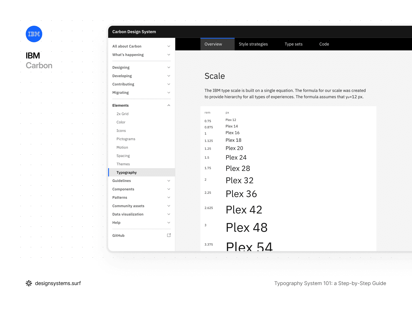
For example, the IBM Design System type scale is built on a single equation. This equation creates a hierarchy that works across many interfaces and experiences, from high-density enterprise products to marketing pages. In this approach, what matters is not the number itself, but the predictability and consistency of the relationships between levels.
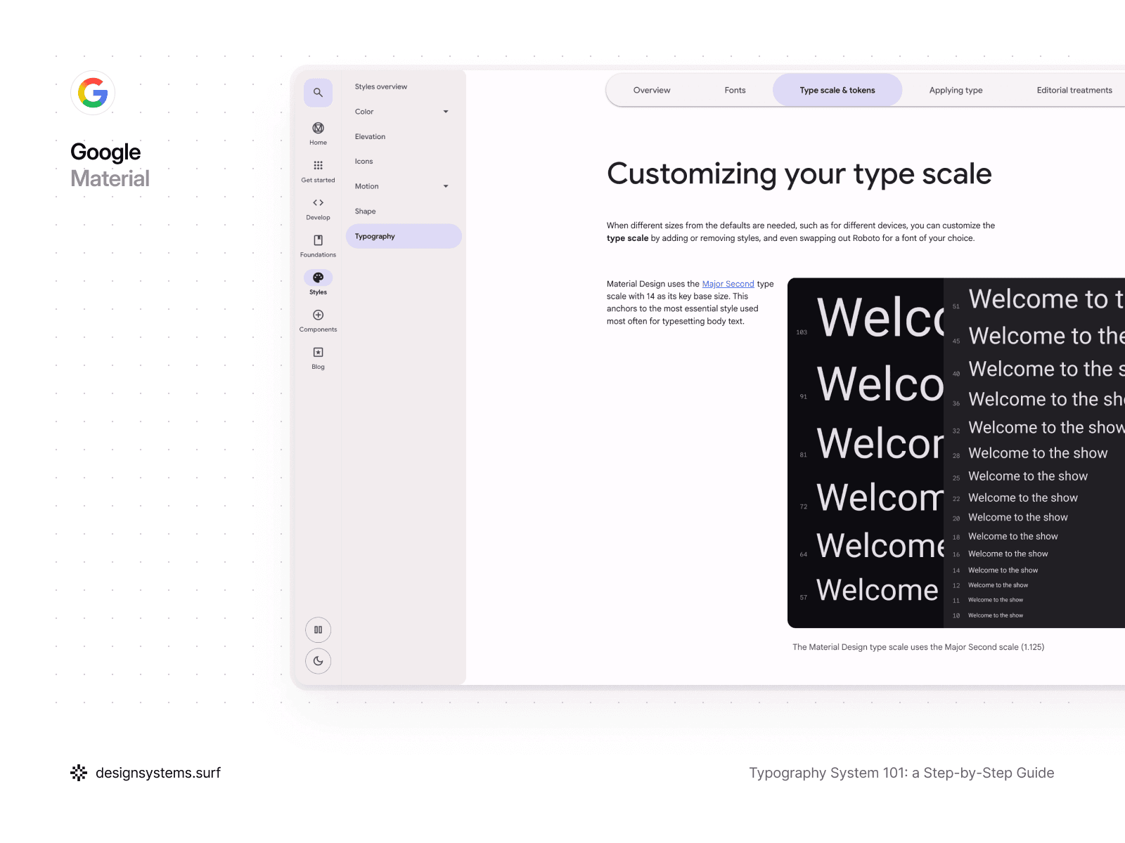
A different approach can also be chosen. Material Design uses a Major Second type scale with a base size of 14, which serves as the anchor for the most frequently used style—body text. This base size becomes the foundation for the whole hierarchy and keeps typography readable and stable across different screens.
Both approaches solve the same problem—creating a clear and manageable hierarchy. At the same time, the choice of a specific ratio or base size is not a critical architectural decision. You can choose any option because a properly designed Scale can always be replaced or adjusted without destroying the system. If all subsequent layers reference the Scale instead of storing values within themselves, the system adapts as a whole.
Furthermore, a Scale does not have to be large. An overly detailed Scale complicates the system and encourages redundant decisions. In a well-built typography system, the Scale covers the primary ranges, and fine-tuning happens at the Token and Role level. The Scale sets the direction and proportions, not the final look.
It’s important to understand that a Scale covers more than font size. In a correct architecture, it becomes a shared coordinate system for typography. Font size, line height, and sometimes letter spacing can be linked to a single Scale or to coordinated Scale structures. This allows the system to evolve holistically rather than breaking down into independent parameters.
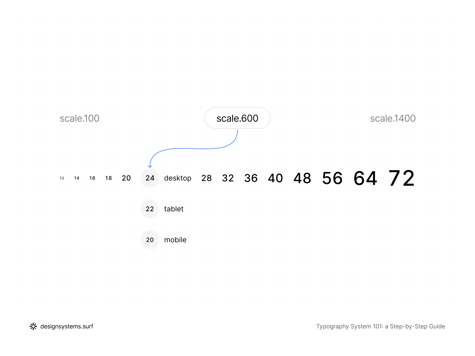
When a typography system needs to be responsive, the Scale plays an even more vital role. Instead of manually reducing text styles Figma provides for tablet and mobile, the system adapts through modes. The same Scale can have different values for desktop, tablet, and mobile, while the proportions and hierarchy remain preserved. As a result, the typography feels consistent across all devices, even if the absolute sizes differ.
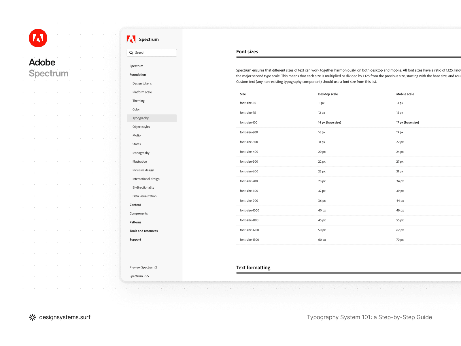
For example, Adobe Spectrum uses a Major Second type scale with a ratio of 1.125, which is applied to both desktop and mobile. All font sizes are calculated using a single formula starting from a base size and then rounded. In this case, the mobile version of the Scale is not a separate system—it is the same Scale, but with different values assigned to that mode. This approach ensures that hierarchy and rhythm are preserved regardless of the device.
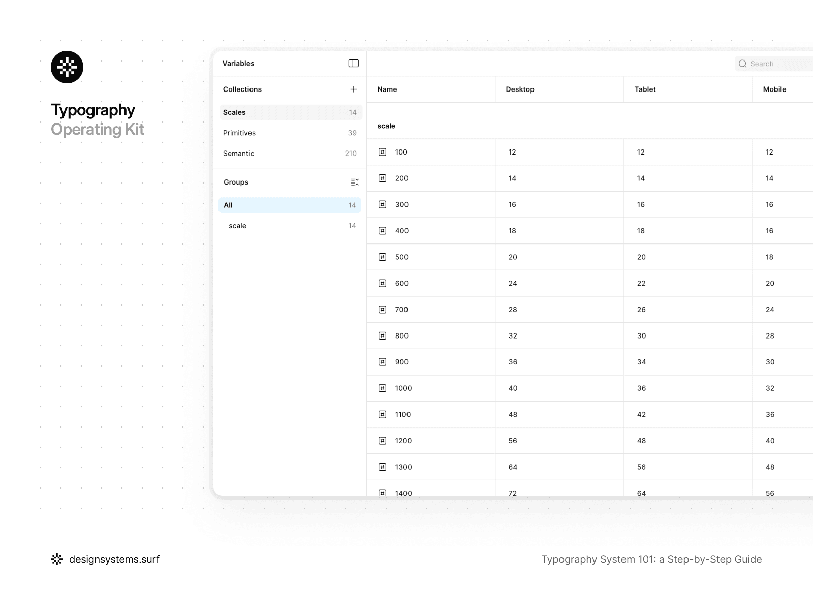
In the product, the Scale exists as a distinct layer with its own responsibility. It is organized as a Scale collection with modes for desktop, tablet, and mobile. All subsequent layers of the system reference the Scale but do not modify it directly. This creates a clear boundary: the Scale can be adjusted without touching Text Styles, and vice versa.
A simple test for the Scale is this: if you change a few values, does everything update predictably and across the whole system? If the answer is "yes," the Scale is fulfilling its purpose. If the changes require manual edits to styles, it means the Scale is either missing or being used incorrectly.
At this stage, the typography system still does not describe specific typographic properties or text usage scenarios. The Scale defines only relationships, proportions, and hierarchy, without being tied to roles, styles, or components. This is an intentional constraint. The Scale creates a stable framework for the system that can be adjusted or even completely replaced without destroying the architecture. In the next step, we will transform this numerical foundation into Primitive Tokens and begin linking the Scale to real typographic properties.


Step 2. Primitive Tokens (from scale to typographic properties)
After the Scale has been defined, the typography system remains abstract. We have a numerical structure and relationships between sizes, but we do not yet have a single specific typographic property that can be used in the interface. This step turns the Scale into a set of Primitive Tokens without adding meaning or roles too early.
Primitive Tokens represent the lowest and most stable layer of a typography system. They describe the fundamental properties of text: font family, font weight, font size, line height, and letter spacing. At this level, the system still has no concept of what a "Body," "Headline," or "Label" is. Primitive Tokens sit outside any usage context, so they can stay stable even as roles or styles evolve.
Font size tokens reference the Scale directly. Instead of storing absolute values within Text Styles, text sizes become derivatives of the Scale and inherit all its changes. These typography tokens create a clean, neutral base upon which a semantic layer will later be applied.
Line height and letter spacing must also be anchored to the system rather than being manually selected for each style. They can rely on the same Scale or a coordinated step structure that maintains text rhythm as sizes change. It is vital that line height does not exist in isolation or become a source of random visual decisions when adapting between devices.
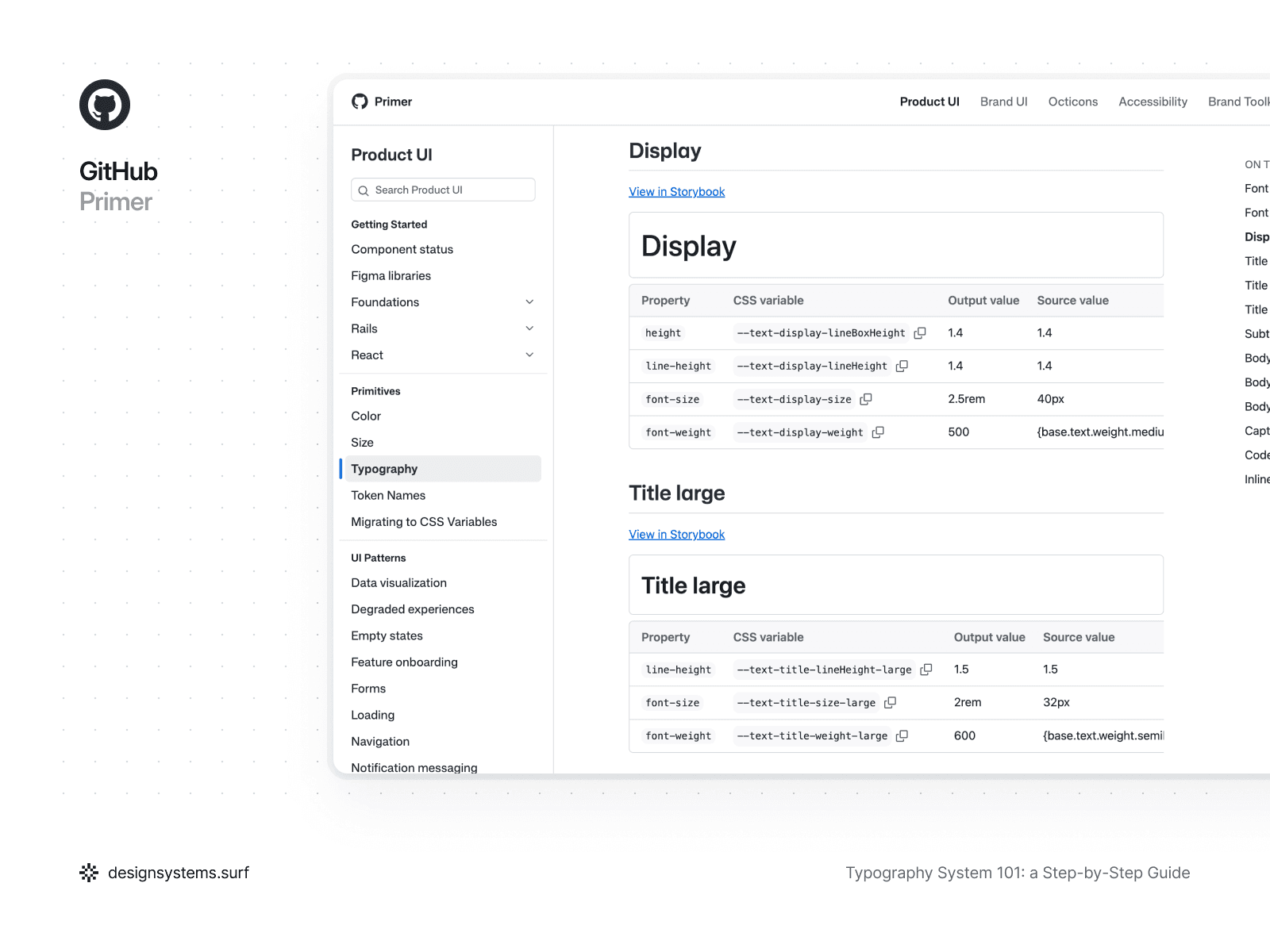
On the other hand, not all typographic properties must be rigidly tied to a numerical Scale. For instance, line height can be defined in relative units or percentages, as seen in GitHub Primer. This approach simplifies typography adaptation when font size changes, allowing readability to be maintained without the need to recalculate values for every step of the Scale. In this case, line height remains part of the system but is expressed through a relative rule rather than a fixed number.
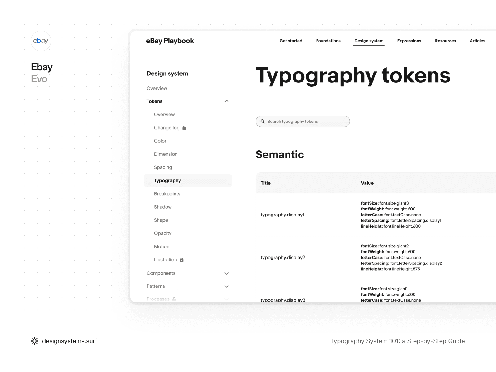
Letter spacing, in turn, can be driven by typographic intent rather than a Scale. In eBay Evo, letter spacing is defined through semantic values tied to roles and signals rather than specific sizes. Tokens like font.letterSpacing.display1 or font.letterSpacing.signal2 describe the character of the text and its visual behavior rather than its absolute parameters. This is particularly useful for display and signal levels of typography, where density and expressiveness are more important than the strict proportionality of a Scale.
Consequently, Primitive Tokens do not have to be structured identically for all properties. The key is that every decision remains systemic, predictable, and aligned with the rest of the architecture. The Scale provides the foundation but does not limit the choice of approaches, and it is this flexibility that makes a typography system robust and adaptable.
Font family and font weight at this stage fix the permissible options within the system. Primitive Tokens define which fonts and weights exist in the product but do not decide where exactly they are applied. This allows you to limit variance and eliminate the accidental introduction of new fonts or weights at the level of individual components.
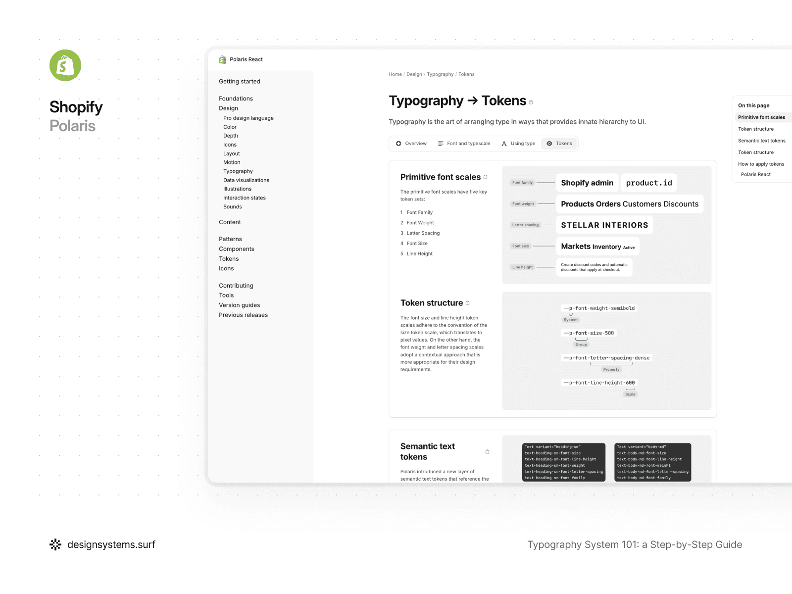
For example, in Shopify Polaris, typographic values are broken down into basic token scales for font family, font weight, font size, line height, and letter spacing. Font size and line height follow a numerical scale and translate into specific pixel values, while font weight and letter spacing are described through more contextual, yet still primitive, values. These tokens do not encode roles or usage scenarios and exist as a fundamental layer upon which semantic values and components are later built. This approach allows Polaris to change the scale, weights, or typography density without rewriting styles or breaking the system's structure.
The key idea behind Primitive Tokens is that they do not express intent. A token like font-size-400 does not mean "Body text" and does not imply any specific role. It simply describes a value available to the system. As soon as Primitive Tokens begin to encode meaning, the system loses flexibility and becomes fragile.
This is precisely why Text Roles and Semantic Tokens should not appear at this stage. Primitive Tokens create a clean, neutral base upon which a semantic layer will later be applied. This allows you to change the structure of roles without rewriting the foundation of the system.
In the product, Primitive Tokens are organized as separate token collections and reference the Scale via variables and modes. They become the single source of truth for typographic properties and are used by all subsequent layers, without being directly visible to most of the system's users.
A good test for Primitive Tokens is simple: if you decide to replace a font, adjust weights, or change Scale proportions, would you need to make edits to your Text Styles? If the answer is "no," then the Primitive Tokens are performing their task correctly.
At this stage, the typography system remains neutral. Primitive Tokens define the permissible values and the rules for their formation, but they do not answer the question of which text is used where or what role it plays in the interface. This is a deliberate constraint. Primitive Tokens create a stable foundation that can be modified and expanded without breaking the system. In the next step, we introduce intent and meaning for the first time by defining Text Roles that turn raw typographic values into the product’s language.
Step 3. Text Roles (defining typographic intent)
Up to this point, the typography system has been intentionally abstract. Scales established the proportions, and Primitive Tokens defined the permissible typographic properties, but the system still hasn't answered the fundamental question: what text exists in the product and why? Step 3 is the point where meaning emerges and the language the team uses to discuss typography is established.
Text Roles describe the purpose of text in the interface rather than its visual characteristics. They answer the question of what function the text performs in the product, what hierarchy it creates, and how much attention it should command. This is precisely why Text Roles are not equivalent to font sizes and are not tied to specific Scale values. A role can appear across different screens, contexts, and sizes, and its meaning stays consistent.
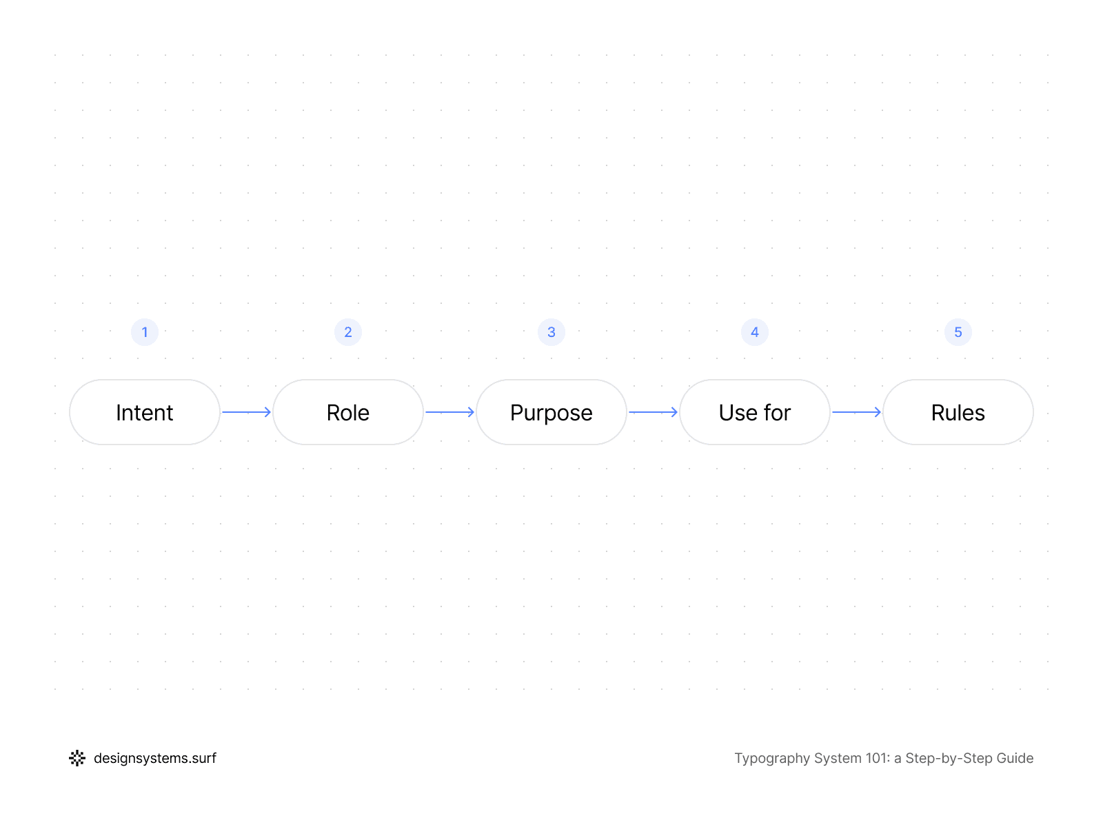
Here is an example of how the Title role can be defined:
Intent | Structural hierarchy |
Role | Title |
Purpose | Organizes sections and defines content hierarchy |
Use for | Screen title |
Rules | One primary title per screen |
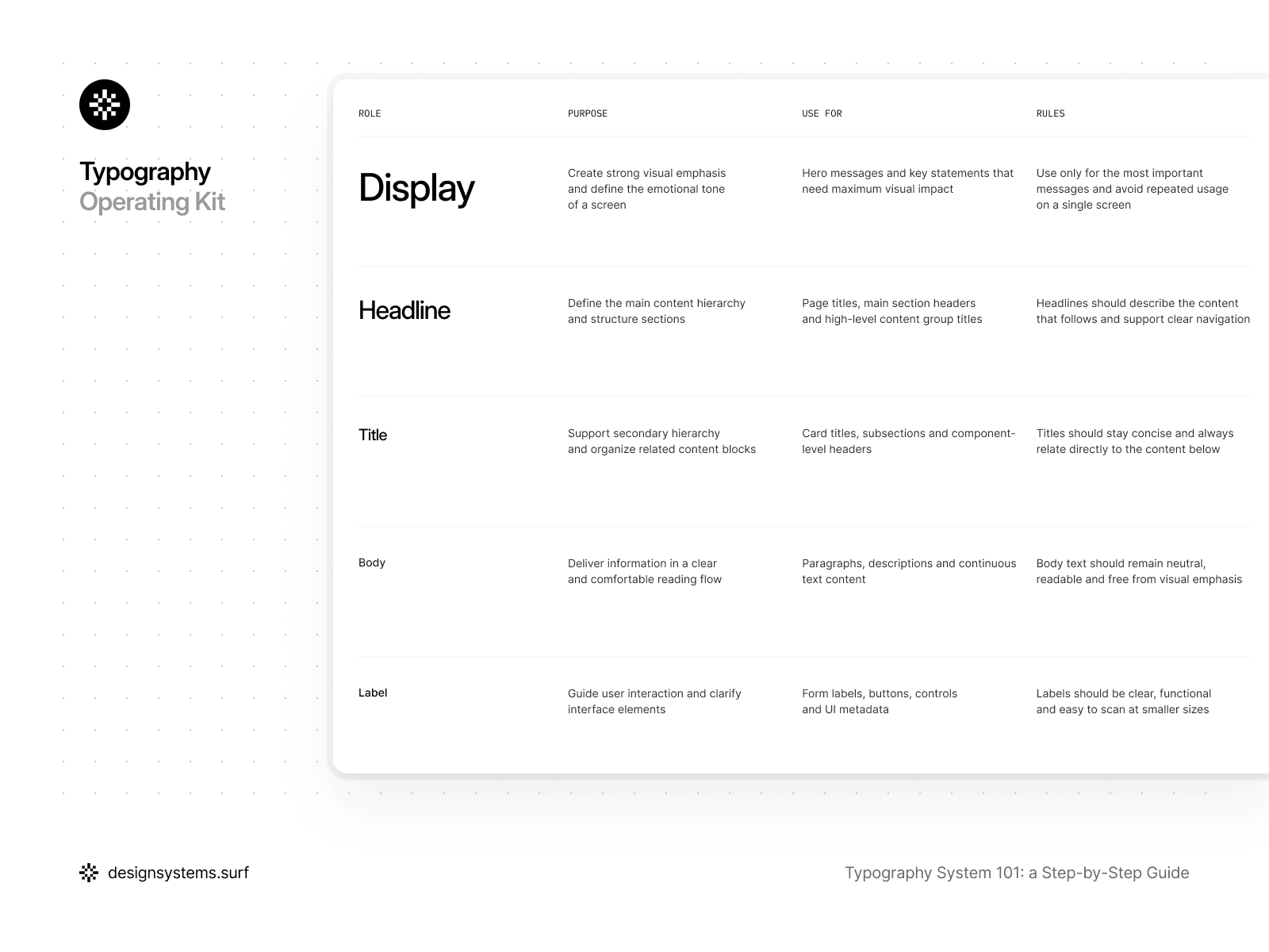
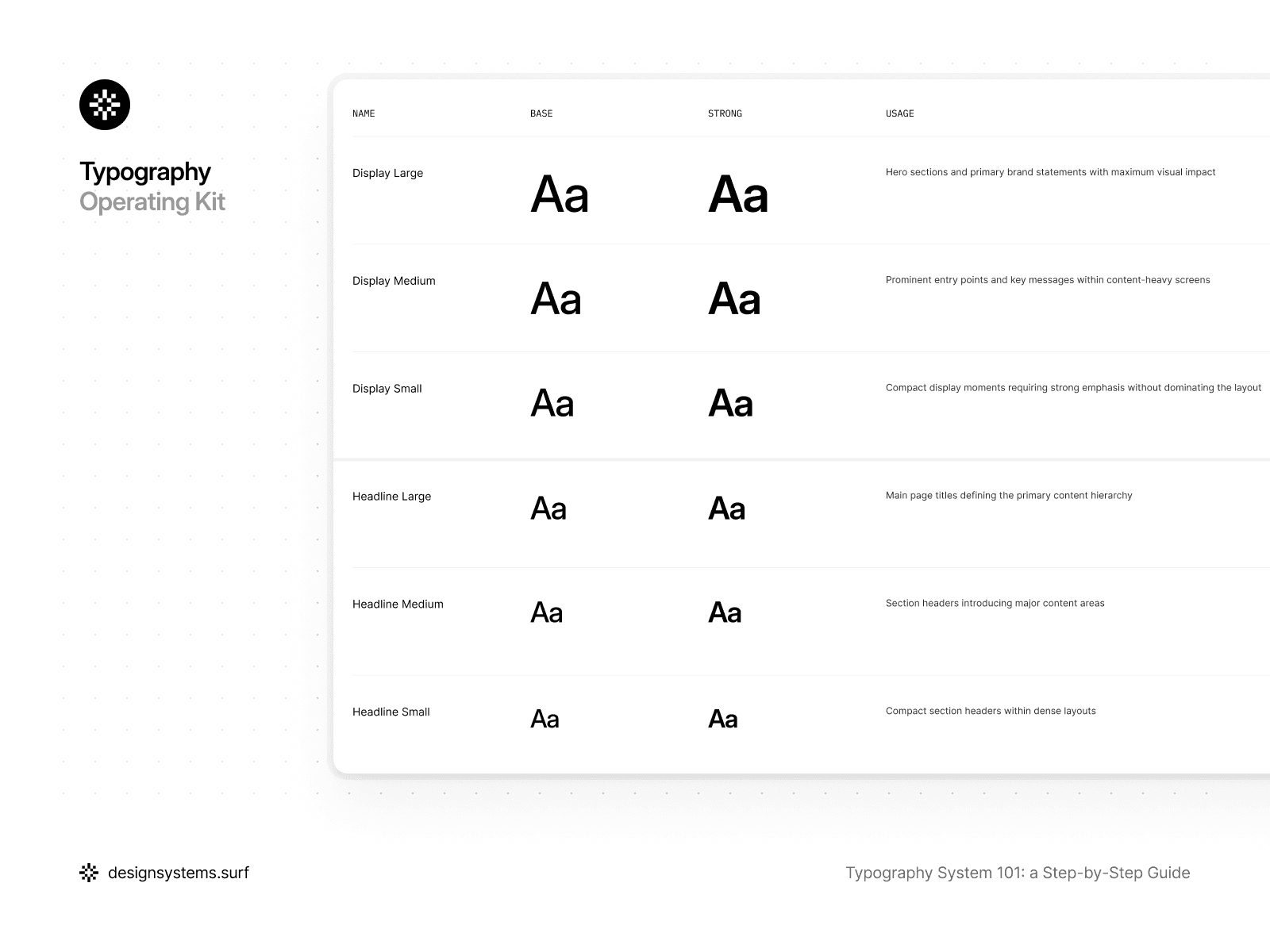
In a well-designed typography system, Text Roles form a limited and stable set:
Display is used for the most expressive and rare moments where it is crucial to grab attention and create an accent, while Headline and Title help structure content and navigation.
Body handles the primary reading flow and must remain as neutral and readable as possible, whereas Label and Caption support the interface. They help users find their way and clarify meaning.
Mono exists for data, code, and technical information where alignment and character predictability are essential.
This set of roles reflects real interface needs rather than visual preferences.
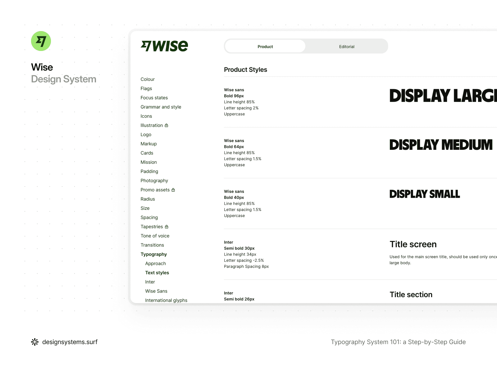
For example, in the Wise typography system, the structure is built around clearly defined Text Roles, within which controlled variations are permitted. The Display role exists as a single type of intent but is implemented through several sizes—Large, Medium, and Small—depending on the context and interface density.
Similarly, the Title role is used for different levels of hierarchy: from screen-level headings to sections and subsections, while all remain within the same semantic category. Body and Link are also presented as roles with variations in size and emphasis, rather than as separate, unrelated styles.
This approach lets the system scale across sizes and states without inventing new roles or watering down the intent. As a result, the typography remains readable, consistent, and easily scalable, even as the interface grows more complex.
The primary objective of Text Roles is to create a shared language for the team. When a designer says, "this is a Headline," and the developer uses the same term in the code, the need to discuss pixels and specific values vanishes. The conversation shifts from "what size should we choose?" to "what role should the text play here?" This reduces the volume of decisions, accelerates workflow, and makes the system resilient as the product grows.
Crucially, Text Roles are defined before Semantic Tokens. Roles define the intent, and the semantic layer translates that intent into concrete values. If you try to create Semantic Tokens without clear roles, meaning starts creeping into numbers and token names, and the system becomes fragile and hard to maintain.
Furthermore, Text Roles are not equivalent to components. The same role can be used across different parts of the interface and within various UI elements. For example, Body can exist in a card, a modal window, or a long-form article without changing its role, even if specific sizes adapt to the context. This allows the system to remain consistent without being rigidly tied to the interface structure.
Within the product, Text Roles exist as a distinct architectural layer. They do not contain values and do not dictate which specific font size or line height will be used. Their purpose is to lock in the intent and serve as an anchor for Semantic Tokens and Text Styles. This is why the number of roles must remain limited. If roles begin to duplicate each other or reflect minor visual nuances, the system loses its clarity.
A simple test for Text Roles is this: if you can explain what each role is for without mentioning sizes, weights, or pixels, then the roles are defined well. If a role cannot be explained without referring to its visual characteristics, it is likely not a role, but a hardcoded style.
At this stage, the typography system begins to operate with meaning for the first time. Text Roles lock in the intent and establish a language for the team to discuss typography without being tethered to specific sizes or values. This allows the system to remain flexible and extensible as the product grows. However, the roles themselves do not contain values—they merely describe what the typography is intended to express. In the next step, we will translate this intent into specific, reusable values using Semantic Tokens.
Step 4. Semantic Tokens (translating roles into values)
Once Text Roles have been defined, the typography system understands what text exists in the product and the meaning it carries. However, the system still doesn't know which specific values should be used for each role. Step 4 is the layer where the intent captured in Text Roles is translated into concrete, reusable typographic values.
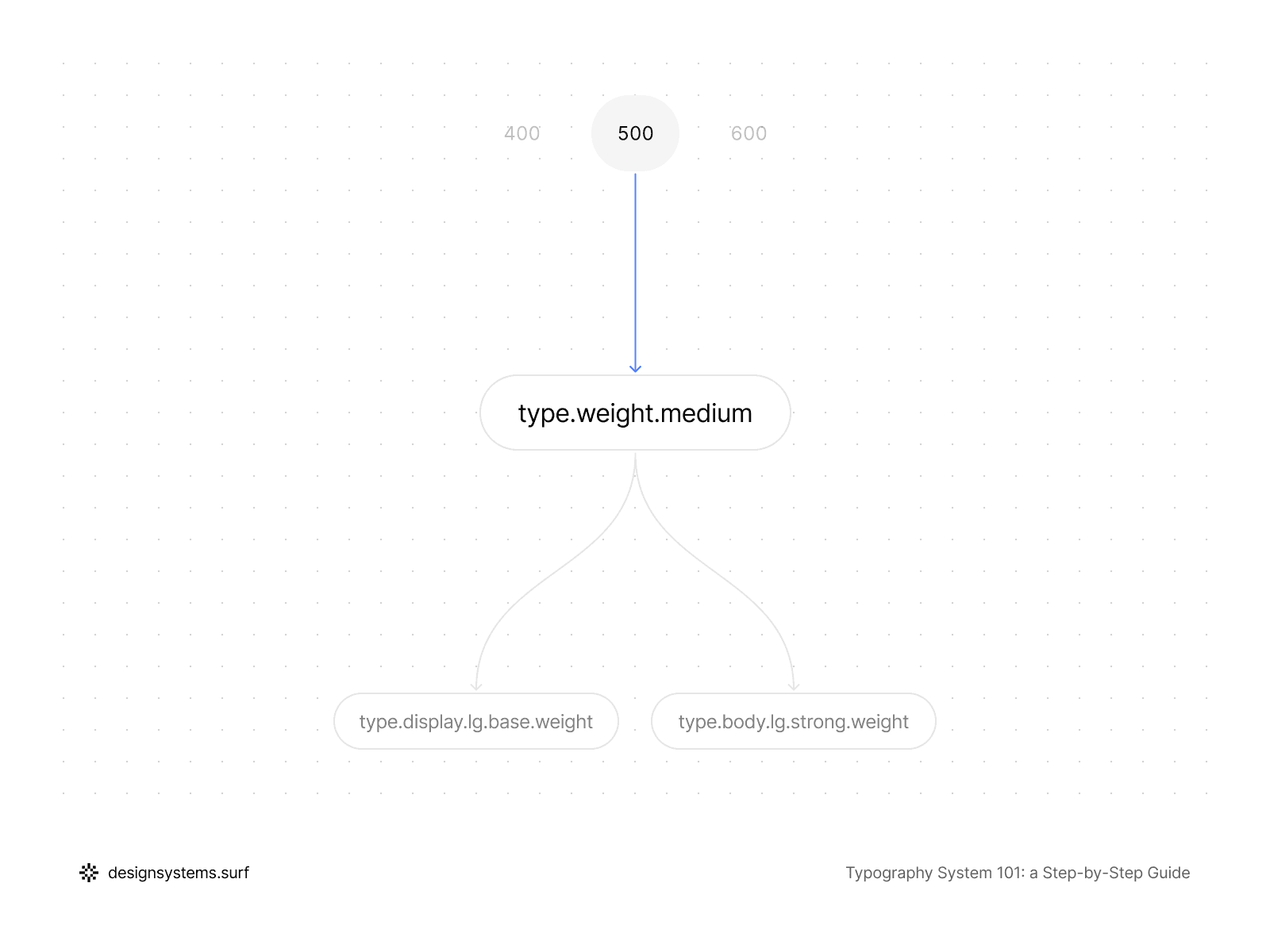
Semantic Tokens bridge the gap between Text Roles and Primitive Tokens. They do not introduce new numbers or duplicate Scale values; instead, they describe which primitive values are used for a specific role and in what context. That’s why the semantic layer sits between roles and styles, instead of trying to replace either one.
The key difference between Semantic Tokens and Primitive Tokens is that they express meaning. A token like font.size.body or font.lineHeight.headline exists not because a certain size exists in the system, but because "Body" and "Headline" are roles that require specific typographic behavior. If a role disappears or changes, semantic tokens can be redefined or removed without touching the foundational layers.
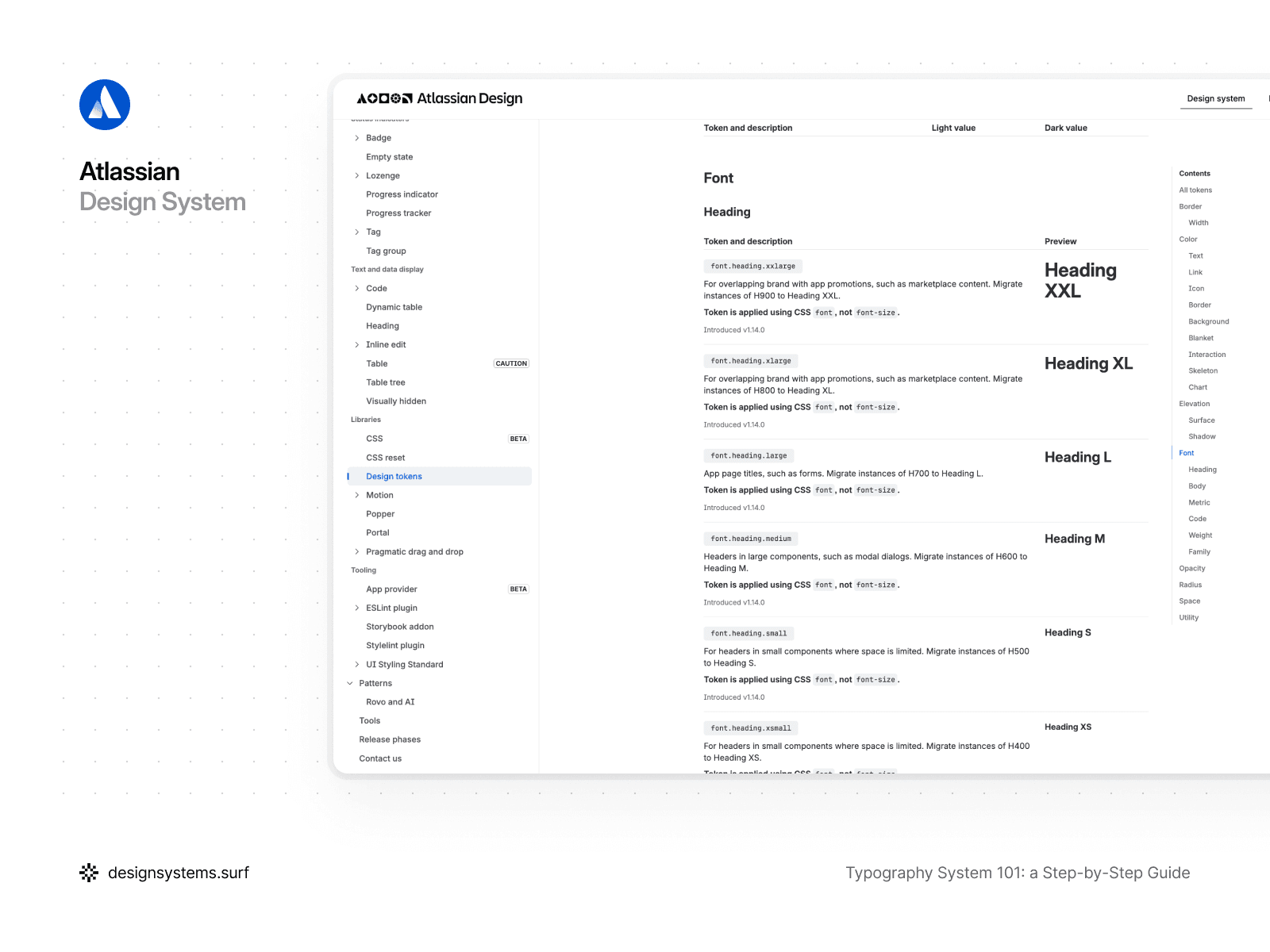
For example, in the Atlassian Design System, the semantic layer serves as the primary contract between intent and implementation. Instead of working with individual font-size or font-weight values, the system operates with semantic tokens such as font.family.heading, font.family.body, font.body, font.heading.large, or font.weight.medium. These tokens describe typographic intent rather than numerical values: which text is a heading, what is body copy, or where code and brand typography are applied. Semantic tokens can also point to different Primitive Tokens depending on context, and the meaning stays consistent.
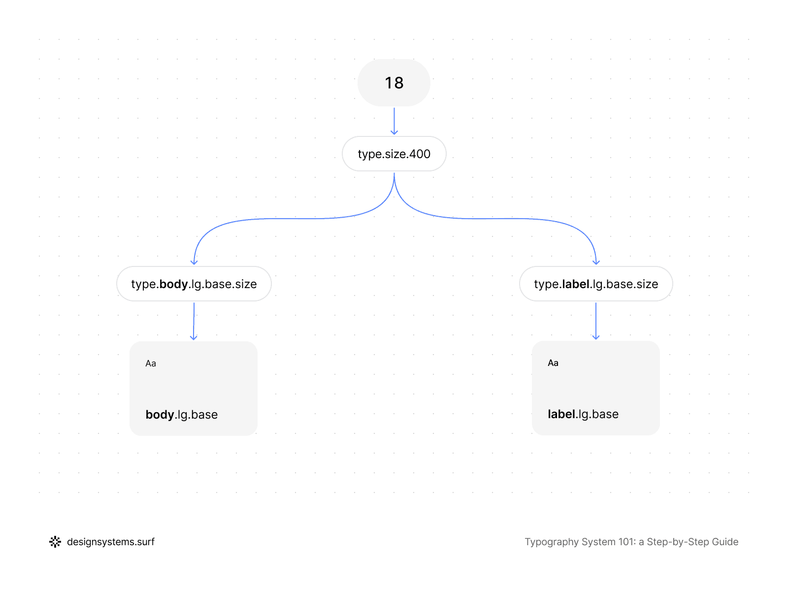
Crucially, Semantic Tokens do not have to be entirely unique for every role. Multiple roles can reference the same Primitive Tokens if their typographic intent aligns. For instance, body and label might share the same font size but differ in line height or letter spacing. Semantic Tokens capture these distinctions directly without duplicating values or breaking the Scale structure.
Semantic Tokens also serve as the point where the system begins to account for variations within roles. If a Text Role includes Large, Medium, and Small sizes, the semantic layer can describe these differences through named values without being tethered to specific pixels. This allows you to adjust the proportions and density of a role in one place without reworking your Text Styles.
It is also vital that Semantic Tokens remain independent of components and usage context. They describe the typographic intent of a role as a whole, rather than a specific UI element. This lets you reuse the same semantic values across the interface and keep a shared language between design and code.
In the product, Semantic Tokens exist as a distinct layer that references Primitive Tokens and is utilized by Text Styles. The semantic layer is what makes the typography system readable. Instead of working with raw numbers, the team works with meaningful names that mirror the product’s structure and logic.
A simple test for Semantic Tokens is this: if you can change Primitive Tokens or the Scale without rewriting the semantic layer, and your Text Styles still update predictably, the layer is built correctly. However, if semantic tokens begin to duplicate numerical values or replace the roles themselves, the system loses its flexibility.
At this stage, the typography system already connects meaning with values. Semantic Tokens translate the intent defined in Text Roles into specific typographic properties without being tied to styles or components. This allows the system to remain flexible and predictable even when the Scale or Primitive Tokens change. However, the semantic layer itself is not yet the point of consumption. In the next step, we will materialize these values into Text Styles—the final layer that the team interacts with directly.


Step 5. Text Styles (from tokens to usable styles)
Up to this point, the typography system has existed as an architecture: Scales defined proportions, Primitive Tokens established permissible values, Text Roles set the intent, and Semantic Tokens linked meaning to typographic properties.
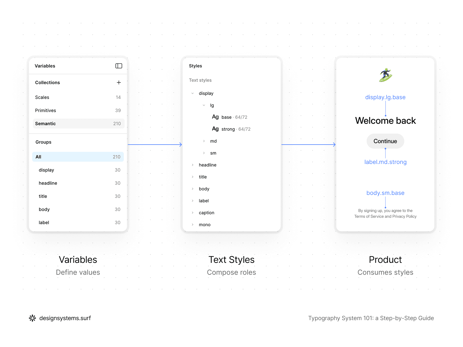
This step is the layer where this entire structure finally materializes into text styles Figma teams work with on a daily basis. Text Styles are not the place for making decisions; they are the place for applying decisions already made in the previous layers.
A good Text Style contains no values of its own and adds no new logic. It simply bundles Semantic Tokens into a specific combination ready for use in the interface.
That’s why Text Styles belong at the very end of the system. The moment a style starts “thinking” by storing its own font size, line height, or weight, it stops being a style and becomes a new source of drift. In a well-built typography system, Text Styles are never the source of truth. The source of truth lives higher up in your tokens and roles.
Text Styles should be as predictable and "boring" as possible. Their job is to eliminate choice, not create it. When a designer picks a Text Style, they are choosing a role and a variation, not a bundle of individual typographic settings. This reduces cognitive load and makes the system faster to use, especially for new team members.
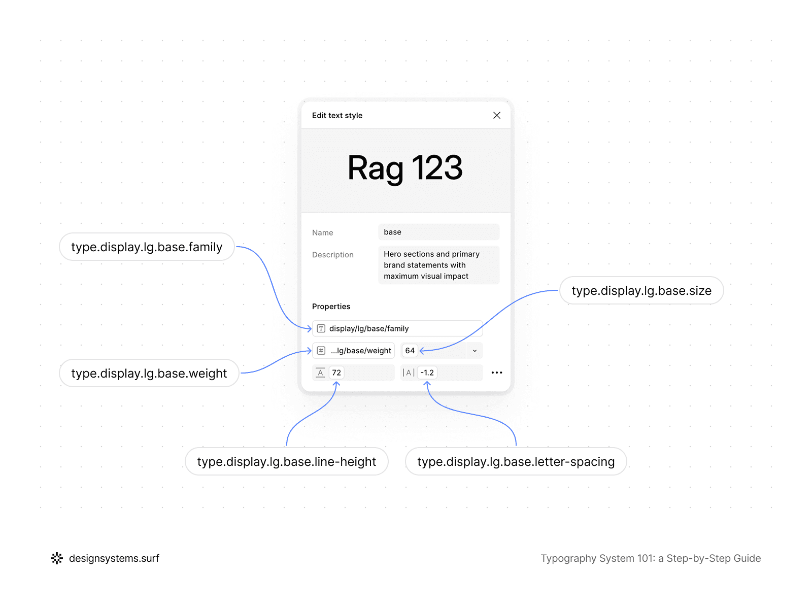
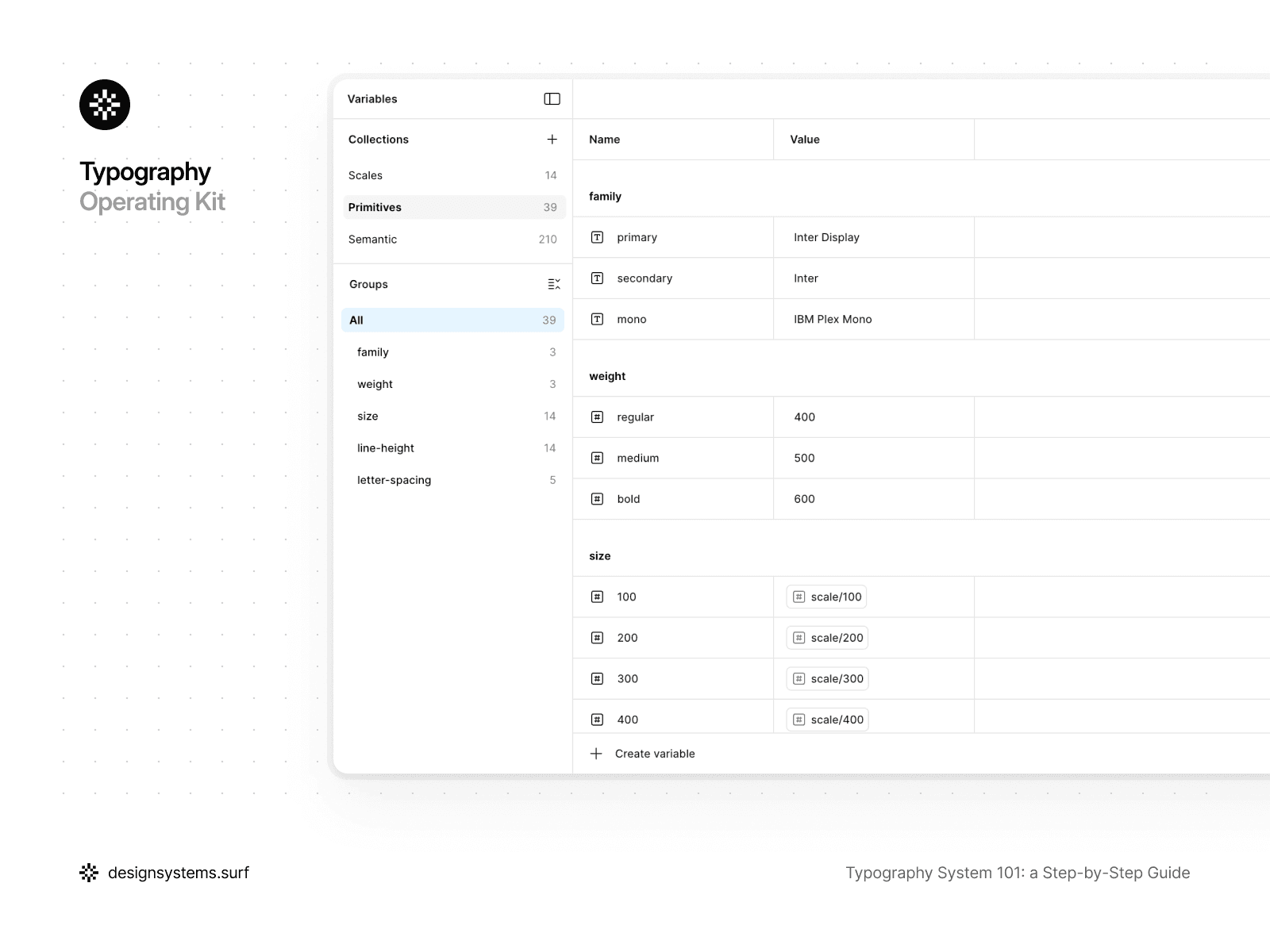
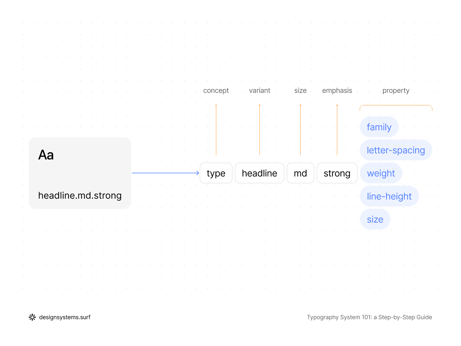
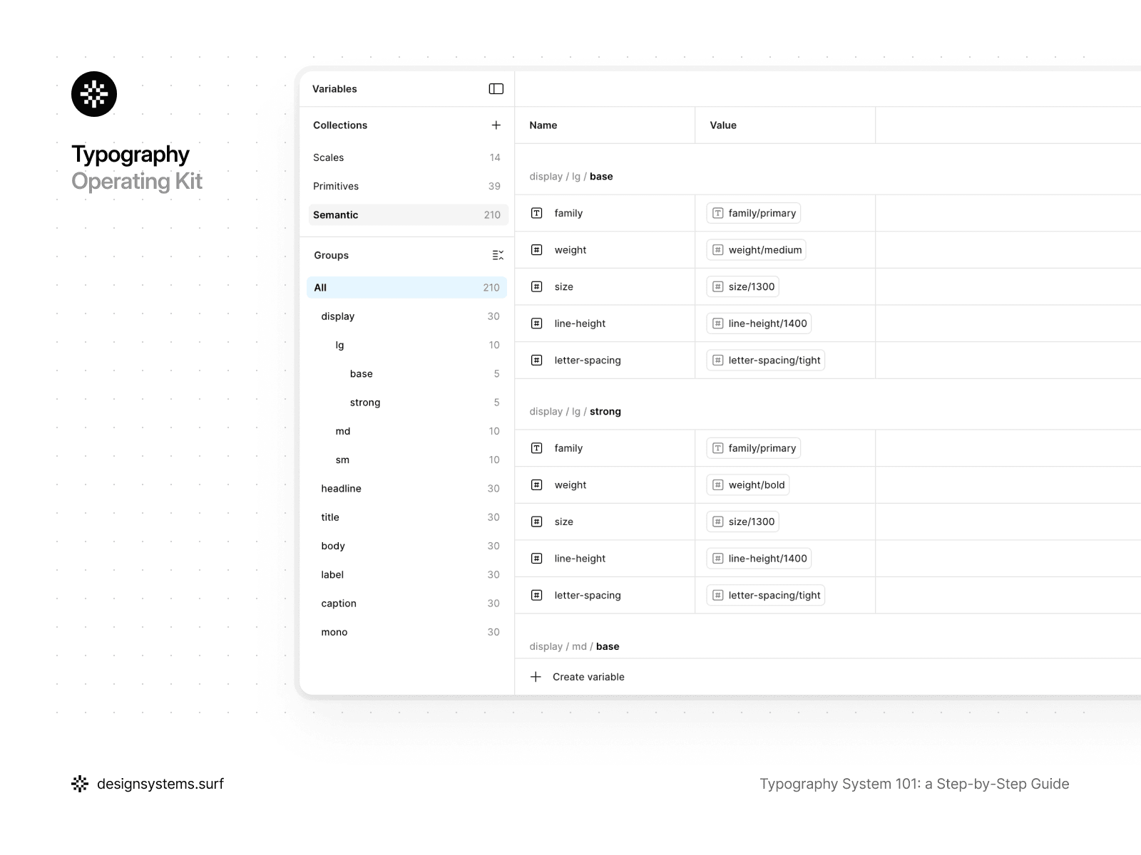
For example, in the Typography Foundation Operating Kit, Text Styles are the final layer that brings together everything defined in the earlier steps without adding new decisions. By this point, Scales, Primitive Tokens, Text Roles, and Semantic Tokens already exist in the system, and it is the semantic layer that becomes the sole source of values for the Text Styles.
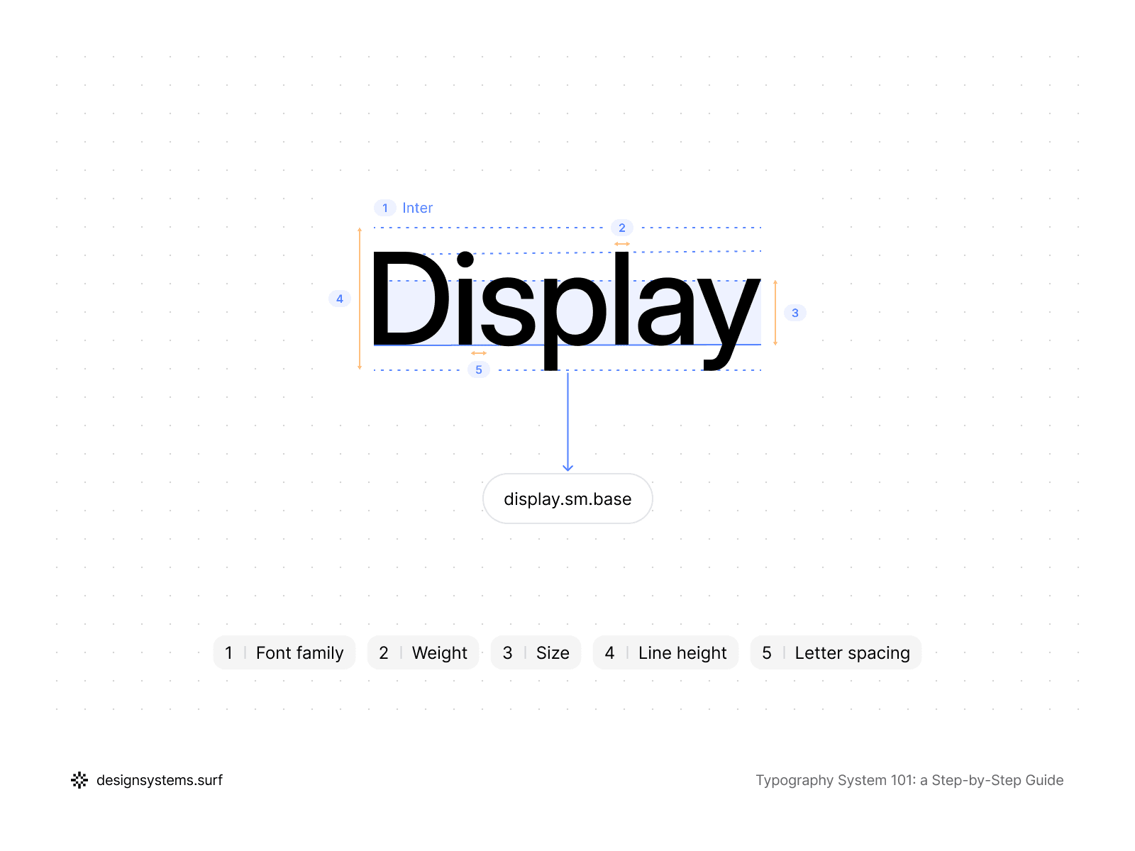
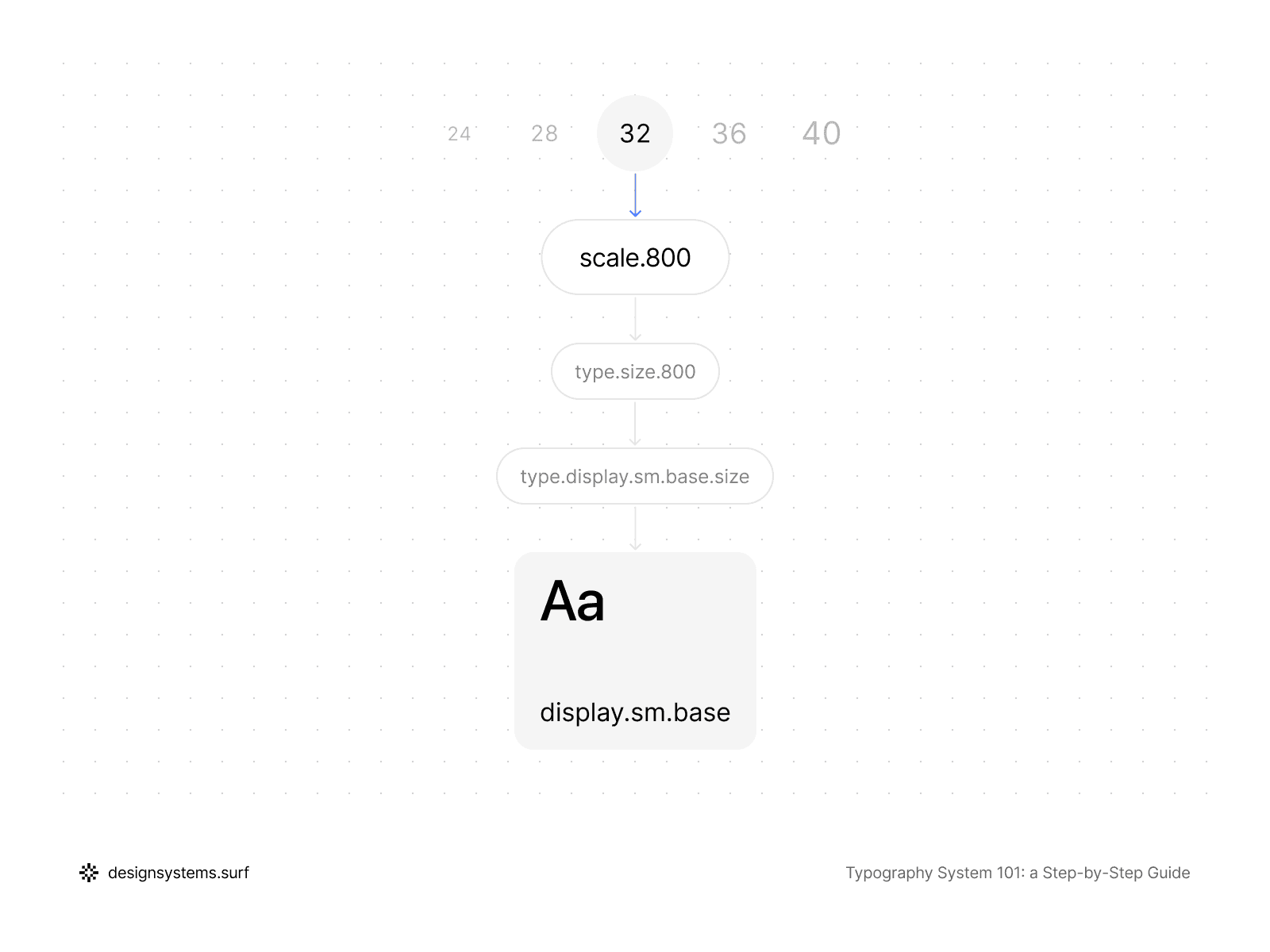
A style is described through a role-based structure such as display/lg/base, where display corresponds to the Text Role, lg to the size variation, and base to the specific behavior variant. Inside the properties, there isn't a single hardcoded value: font family, weight, size, line height, and letter spacing are linked exclusively via Semantic Tokens. A Text Style "knows" no numbers and does not reference Scales or Primitive Tokens directly—it works only with meaningful semantic values.
Even if the editing interface displays final numbers (such as font size or letter spacing), these are merely the output of calculations within the system. From an architectural standpoint, a Text Style remains a thin layer that connects intent and the semantic layer to specific usage in layouts. Because of this, any change to the Scale, Primitive Tokens, or semantic mapping automatically updates all Text Styles without the need for manual edits.
This specific constraint is what makes Text Styles resilient. They cease to be a place for experimentation and instead become a stable API for the typography system. The team selects a role and a variant, and the system handles the rest: consistent results, responsive behavior, and predictable updates over time.
It is crucial that Text Styles directly inherit the responsive behavior of the system. If the Scale or Primitive Tokens include modes for desktop, tablet, and mobile, the Text Styles adapt automatically without the need to create separate "mobile styles." This is a key hallmark of a mature system: responsive logic resides in the foundation, not in the individual styles.
Text Styles are also the point where the typography system interfaces with components without becoming part of them. One Text Style can be reused across many UI elements and contexts, without being tied to a specific component. This allows for maintaining consistency without a rigid link between typography and interface structure.
In the product, Text Styles are a separate layer that references only Semantic Tokens. They should never point to Primitive Tokens or the Scale directly, because that breaks the hierarchy. This separation lets you update the layers underneath without rewriting styles or breaking existing layouts.
A good test for Text Styles is simple: if you can strip all values from a style and fully reconstruct it using only token references, then the style is defined correctly. If, however, a style cannot be explained without listing specific numbers, the system has failed somewhere along the line.
At this step, the typography system becomes truly usable. Text Styles connect your token and role architecture to the team’s day-to-day work, without adding new decisions or weakening the structure. If all previous layers have been designed correctly, Text Styles remain simple, predictable, and easy to maintain.
Next, we’ll look at how to keep the system healthy over time with clear rules, reviews, and governance.
Step 6. Governance (Keeping the System Healthy Over Time)
A typography system is only truly complete when it is clear how it will evolve. Without governance, even the most meticulously designed system eventually returns to chaos: "one-off" text styles Figma users create for temporary tasks appear, and roles begin to overlap.
Governance keeps your system intact over time, so the structure you built does not slowly drift into chaos. A strong governance model is minimal in form but rigorous in essence. It’s not there to get in your way—it’s actually a shortcut that settles the "basic" stuff once and for all, so you don't have to waste time rehashing the same decisions every single day.
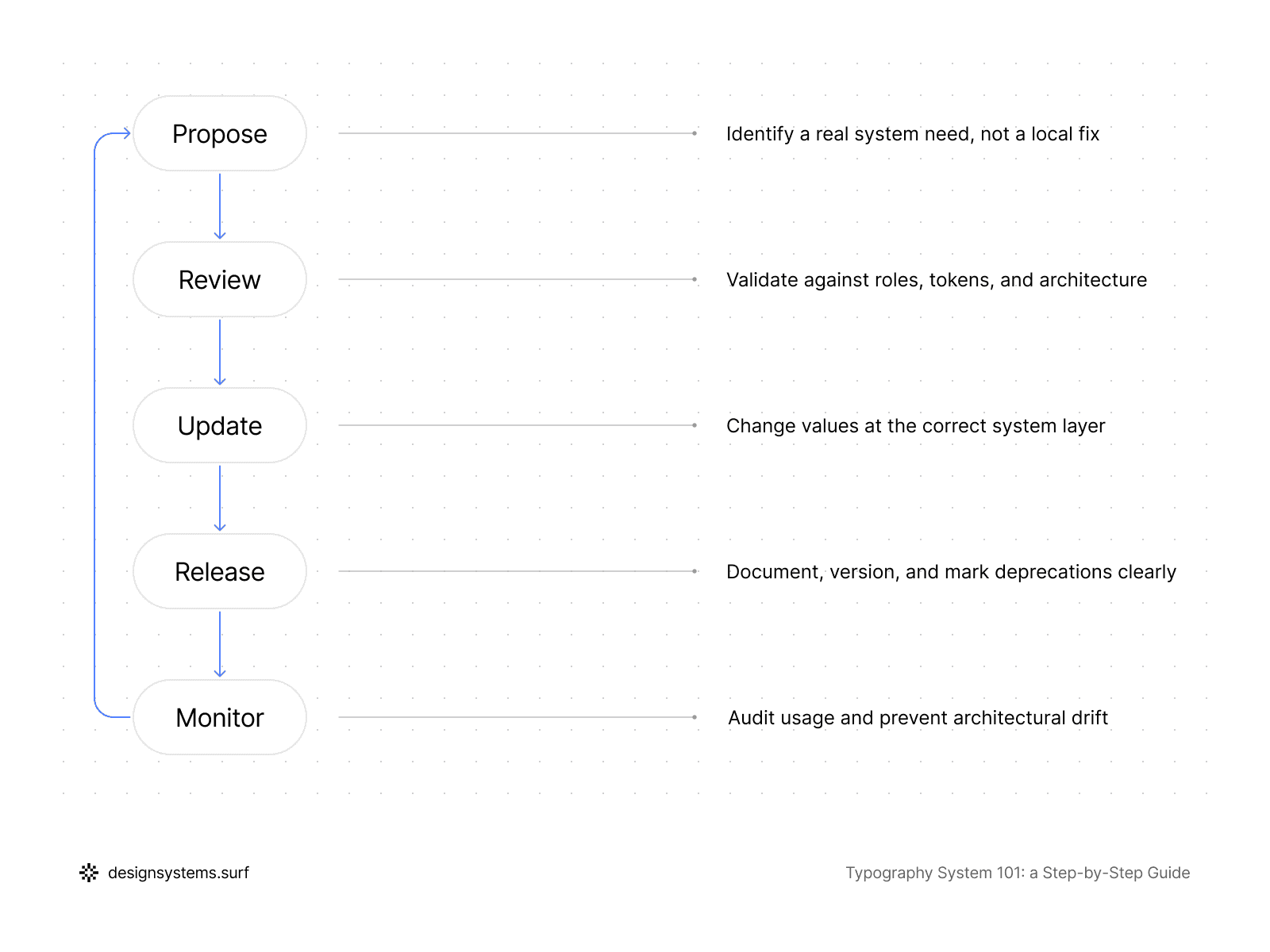
For a typography system to actually survive the long haul, you’ve got to be clear about who has the final say on changes. But here's the trick: when someone asks for a new style, don't just open Figma and start tweaking.
Start with a reality check instead. Ask yourself: is this a completely new role, a variation we missed, or just a case of someone not using the current system right? Honestly, once you start asking those questions, most "we need a new style" requests usually solve themselves.
It is equally important to define how the system evolves. If a change is required—such as modifying the type scale—it must be executed at the appropriate level rather than by editing individual styles.
Specific attention must be paid to deprecation. Legacy Text Styles and semantic values should never disappear overnight. Instead, you label them as deprecated and point everyone toward the right replacement, only pulling the plug when the team is actually ready. It’s a way to let the system evolve without breaking things—or everyone’s trust—overnight.
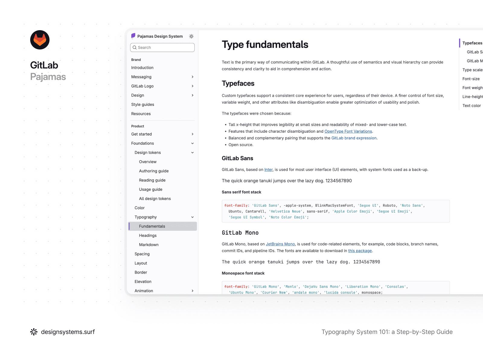
Take GitLab’s Pajamas, for example. They treat typography governance as a guided evolution, because the way the team transitions matters as much as the new values. They roll out typography UI kit updates in clear milestones and never leave you guessing—any tweaks are spelled out in release notes and breaking changes so you know exactly what’s coming. This also covers cases where components use dedicated Text Styles that automatically follow type scale updates, which can change their dimensions or line heights across layouts.
They also follow a clear deprecation rule: once a style or component is marked deprecated, it stays available for at least one full milestone before being removed, giving teams time to migrate without surprises. This approach is tied to a contribution lifecycle where every change updates design, code, and documentation together, keeping the system reliable and typography consistent end to end.
Governance also sets the rhythm for system revision. Typography rarely breaks all at once; it degrades gradually. A periodic review of Text Styles, roles, and the semantic layer helps you spot duplicates, "intent drift," or architectural bypasses in time. Even an infrequent but regular review keeps the system in a healthy, operational state.
In a product, governance doesn't necessarily need to be a separate tool or a complex process. Most often, it consists of a few established rules understood by the entire team and a single responsible layer (or person) tasked with monitoring the system's integrity. This keeps typography consistent, so it stays a system instead of sliding back into one-off, local decisions.
At this stage, the circle is complete. The typography system now has a foundation, meaning, values, points of application, and rules for maintenance. From here, it can grow alongside the product without losing its structure or predictability.
Conclusion
Think of a typography system as less of a "greatest hits" collection of pretty styles and more of a solid logic chain. This reflects more than one designer’s personal vibe. It’s a clear structure where each layer has a specific job and builds on the layer before it. When you get this right, typography stops being something the team constantly bickers over and finally becomes what it should be: a reliable, high-performance engine for your product.
We started by getting one thing straight: a "finished" system is a stack of working layers. We laid the groundwork with scales, turned those into basic primitive tokens, and then gave them some purpose with text roles.
From there, we used semantic tokens to connect the reasoning to the output, and then turned that logic into the everyday text styles you actually use. Finally, we added some guardrails to make sure the whole thing stays solid and doesn’t turn back into a mess in six months.
The big idea here is simple: you make a decision once, and it ripples everywhere. When something needs to change, you fix it at the source instead of playing "whack-a-mole" with a bunch of random, one-off overrides. You can tweak the scale, swap fonts, or adjust density, and the whole system updates predictably without manually editing hundreds of styles.
Such a typography system works not because it is complex, but because it is constrained. There is less choice, fewer exceptions, and less room for debate. This setup gives designers and engineers a shared language, so the team can finally stop debating pixels and get back to building the actual product.
If you’re just starting out, consider this your "future-self" insurance against total chaos. If you’ve already got a system in place, it’s a clear roadmap for cleaning things up without needing a total "burn-it-down" rewrite. Either way, the goal is the same: turn typography into something stable your team can build on, not a growing pile of quick fixes.
A typography system doesn't have to be perfect. It has to be understandable, scalable, and alive. Everything else is just a detail that the system will handle for you.

