

In this article, I collected the best design system examples to learn from in 2026, plus a few hidden gems worth bookmarking. I focus on what makes each system useful in practice: how clear the documentation is, how components and UI patterns are explained, how foundations like typography and tokens are handled, and what you can borrow for your own work.What is a design system?
A design system is a shared language a team uses to build consistent products across screens, teams, and platforms. It acts as a single source of truth for how your brand shows up in a website application, in software UI, and everywhere users interact with your product.
At its core, a design system includes three layers.
Building blocks
Reusable UI pieces such as components, a UI kit, and established UI pattern decisions like buttons, forms, navigation, and tables. Each component should come with component guidelines so teams understand not only how it looks, but when to use it, how it behaves, and what to avoid.
Foundations and style rules
This is where the system defines its style through color, spacing, grid, iconography, motion, and especially typography. Many modern systems rely on design token sets to capture these decisions in a format that design and engineering can use consistently across products and codebases. Tokens help keep the visual language aligned even as the product scales.
Documentation that makes it usable
A design system is only as strong as its documentation. Great design system documentation examples include usage guidance, accessibility notes, rationale, and plenty of visual examples. Real-world examples matter, too, because they show how the system supports actual flows and layouts, not just isolated components.
If you have explored systems like IBM Carbon, Salesforce Lightning, Microsoft Fluent, or Atlassian, you have seen how this plays out in practice. Each one shows what it looks like when a team keeps everyone aligned, ships quickly, and still makes the product feel like it all belongs together, even across a big ecosystem of screens and teams.


Best Design Systems examples to watch in 2026
Now that we’ve covered what a design system is, let’s look at the best design systems to learn from in 2026. These systems stand out for strong documentation, clear component guidelines, thoughtful typography, and practical visual examples you can actually reuse in your own UI kit.
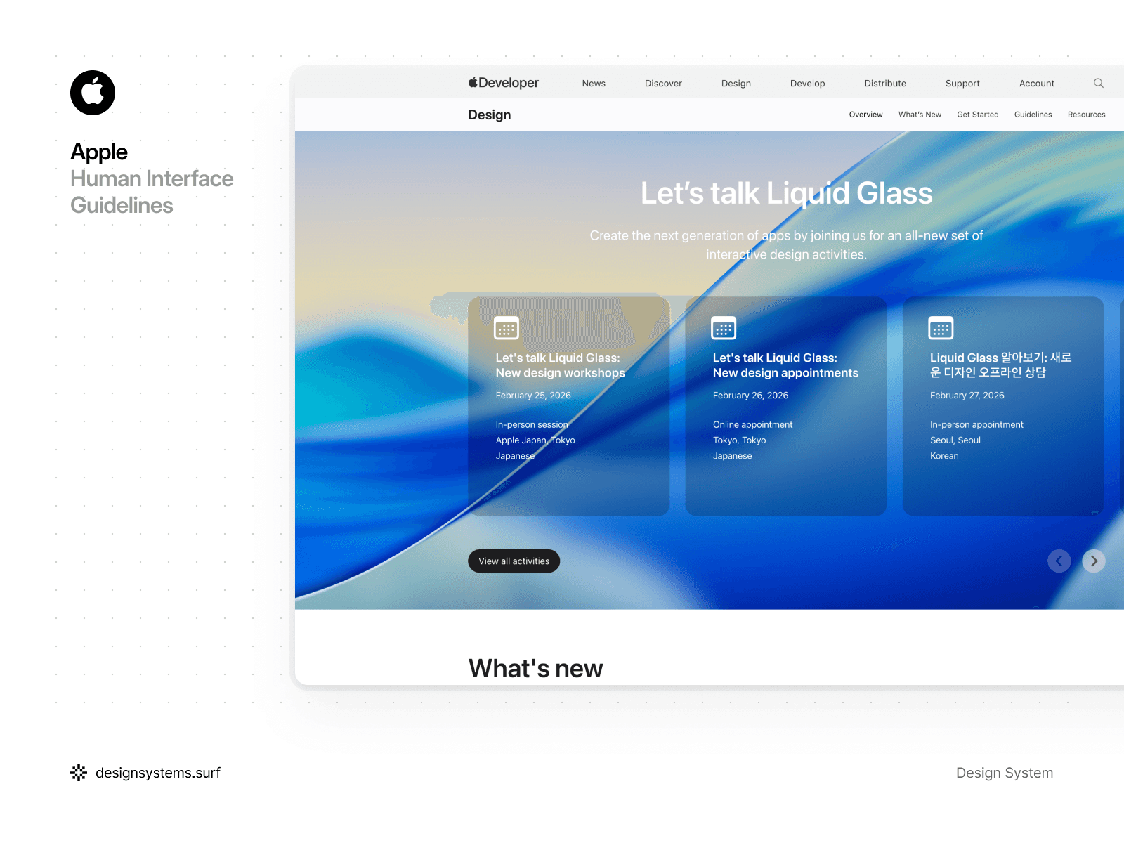
Apple’s Human Interface Guidelines
Apple’s Human Interface Guidelines are probably the most well-known reference in product design. They capture years of thinking about intuitive experiences across iPhone, iPad, and Mac, and they are tightly connected to Apple’s hardware and software ecosystem. That’s what makes HIG different from many design systems. lIt’s less about a set of components, and more about the experience Apple wants users to have.
That said, HIG is not always the easiest resource to use day to day. The guidance can feel very text-heavy, with fewer visual examples than you might expect. In some areas, the guidance stays pretty high-level, so teams can end up guessing whether they’re using the patterns the way Apple meant them to be used.
For many designers, that gap becomes its own learning curve, and it is one reason iOS product design often turns into a specialization.
What stood out
HIG works best as a set of product principles, not a component catalog. It’s great at explaining platform behaviors, navigation patterns, motion, and the interaction details that make Apple interfaces feel distinctly Apple.
But if you are looking for quick component guidelines, dense UI pattern coverage, or lots of concrete visual examples, you may find yourself jumping between pages and filling in the blanks with other resources.
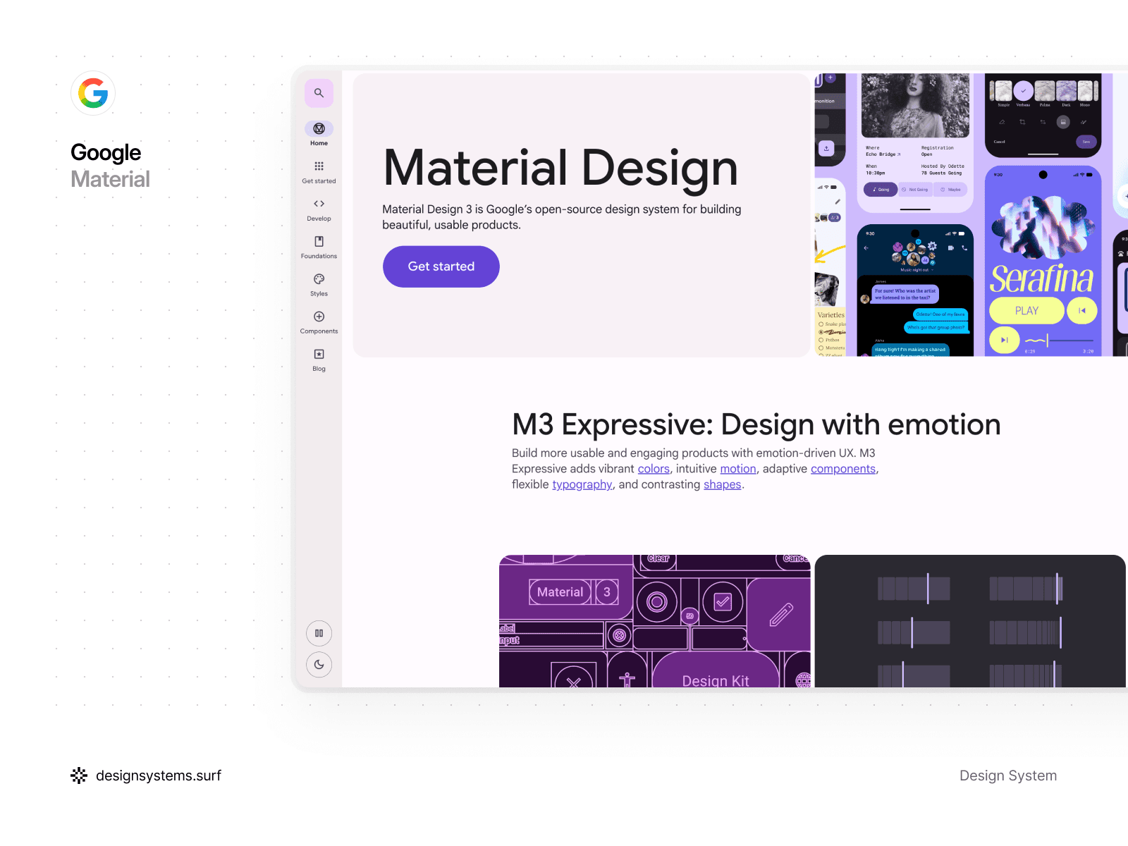
Google’s Material Design System
Google’s Material Design is known for its “material metaphor,” the idea that UI behaves like physical surfaces with depth, elevation, and responsive motion. It is open-source, widely adopted, and built to support adaptive interfaces across devices and screen sizes. Material’s strength is that it does not just define components. It defines interaction principles, motion patterns, and layout logic that help products feel intuitive and consistent.
Material is also not lightweight. The system has a lot of depth, and that can feel complex at first. At the same time, that complexity is part of why Material is so flexible. You can apply it strictly, or you can adapt it heavily and still benefit from its underlying structure. It is the kind of system you can study for days and still find new layers.
What stood out
Material’s color and theming model is one of the most useful parts to learn from. If you are thinking about introducing themes in your own system, this is a strong reference. Material’s approach to tokens, dynamic color, and theme-driven decisions helps teams keep interfaces consistent across personalization, dark mode, and brand variations.
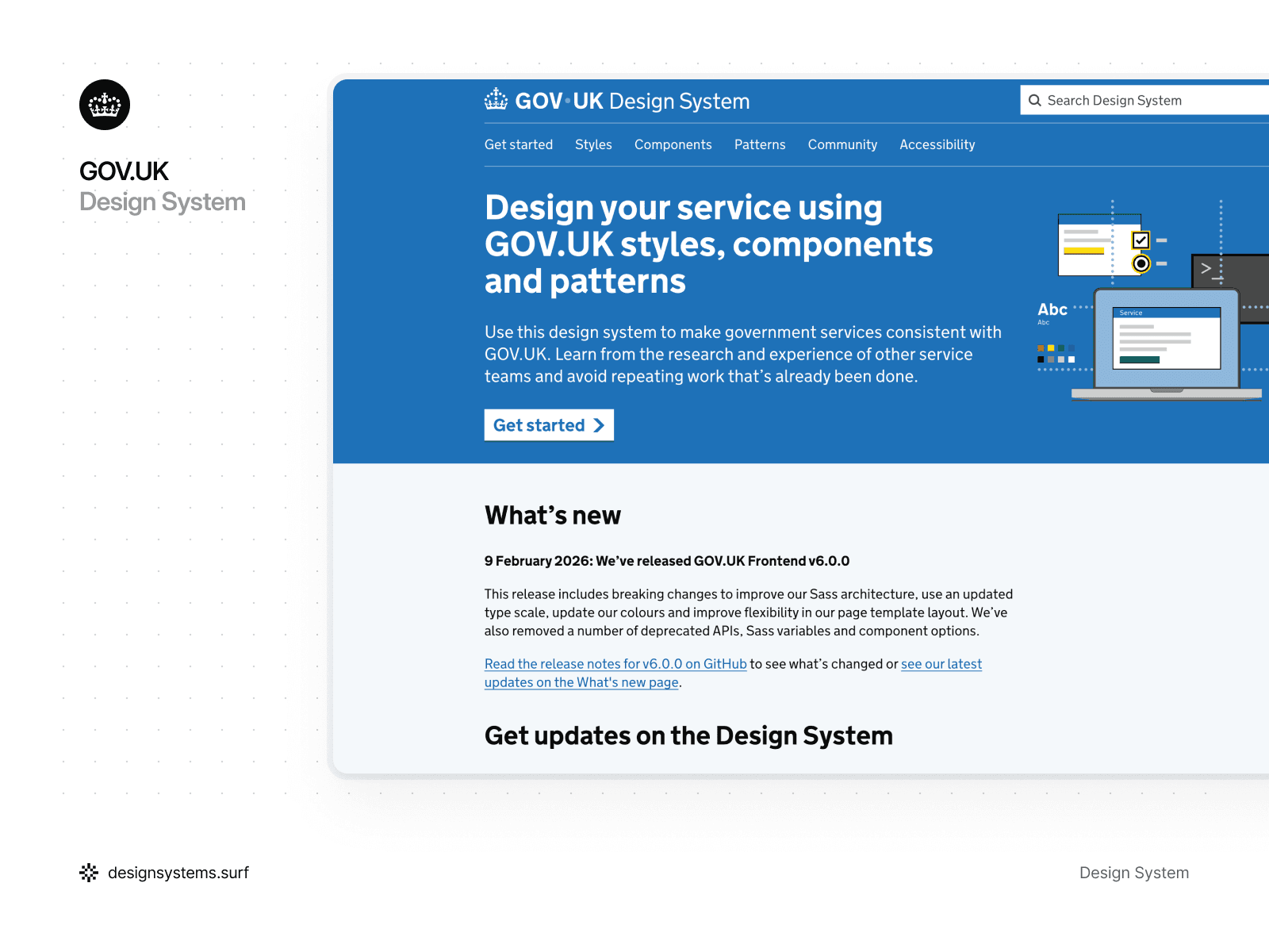
GOV.UK Design System
Surprised to see a government design system among the best design system examples? That’s exactly why GOV.UK Design System deserves a spot on the list. The goal is usability for everyone, including people using assistive tech, older devices, or low-quality connections. It gives public service teams styles, components, and patterns that keep government services consistent across departments, with a clear focus on clarity and accessibility.
A big reason it’s so practical for component research is that the system is built around evidence. When GOV.UK publishes components and patterns, it often includes notes on how and when they were tested, so teams can understand the level of confidence behind a solution.
It’s designed for shipping, not browsing. The code lives in GOV.UK Frontend, and it’s open-source and packaged as a reusable toolkit.
What stood out
Research is part of the workflow. Guidance often links back to user testing, so the patterns feel easier to trust, especially in high-stakes flows. I also like that “experimental” is treated as a real stage rather than a superficial label. New components and patterns ship early, then graduate only after they’ve proven they work across different services and user groups. Accessibility is treated as a core product constraint. That keeps the system focused and intentionally simple.
The result is a system that stays intentionally simple. And it’s a good reminder that for high-stakes services, simplicity is often the most scalable choice.
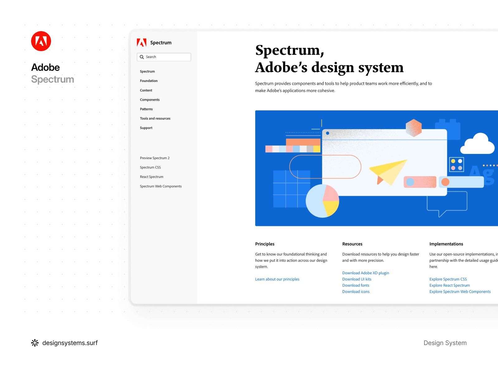
Adobe’s Spectrum Design System
Adobe Spectrum is packed with interface fundamentals, and it reads like a practical UI curriculum. The system covers the essentials such as color, typography, and components, but it also goes further with motion, inclusive design, and a surprisingly detailed copywriting section. The documentation is clear, the visual examples are plentiful, and the component guidelines feel made for teams shipping real products.
What stood out
Most systems keep component and type sizes consistent across mobile and desktop. Spectrum takes a different route. It scales components and typography up on mobile to reflect how people interact with touch screens.
Spectrum uses a 1:1.25 scale ratio, meaning mobile components are 25% larger than their desktop equivalents. It also uses separate typography scales for mobile and desktop. Border widths stay consistent across devices. It’s more complex than most systems, yet it’s a thoughtful way to design for fingers rather than cursors.
Another highlight is the writing guidance. Words carry the interface, yet they are often treated as an afterthought in many systems. Spectrum’s copywriting documentation covers voice and tone, grammar, inclusivity, and even patterns for error messages, which helps teams keep language consistent across products.
Spectrum’s color system is also worth a closer look. Many designers use it as a reference when building palettes because it’s structured, flexible, and practical. If you want a clear lesson in building a usable color system, Spectrum is a strong case study.
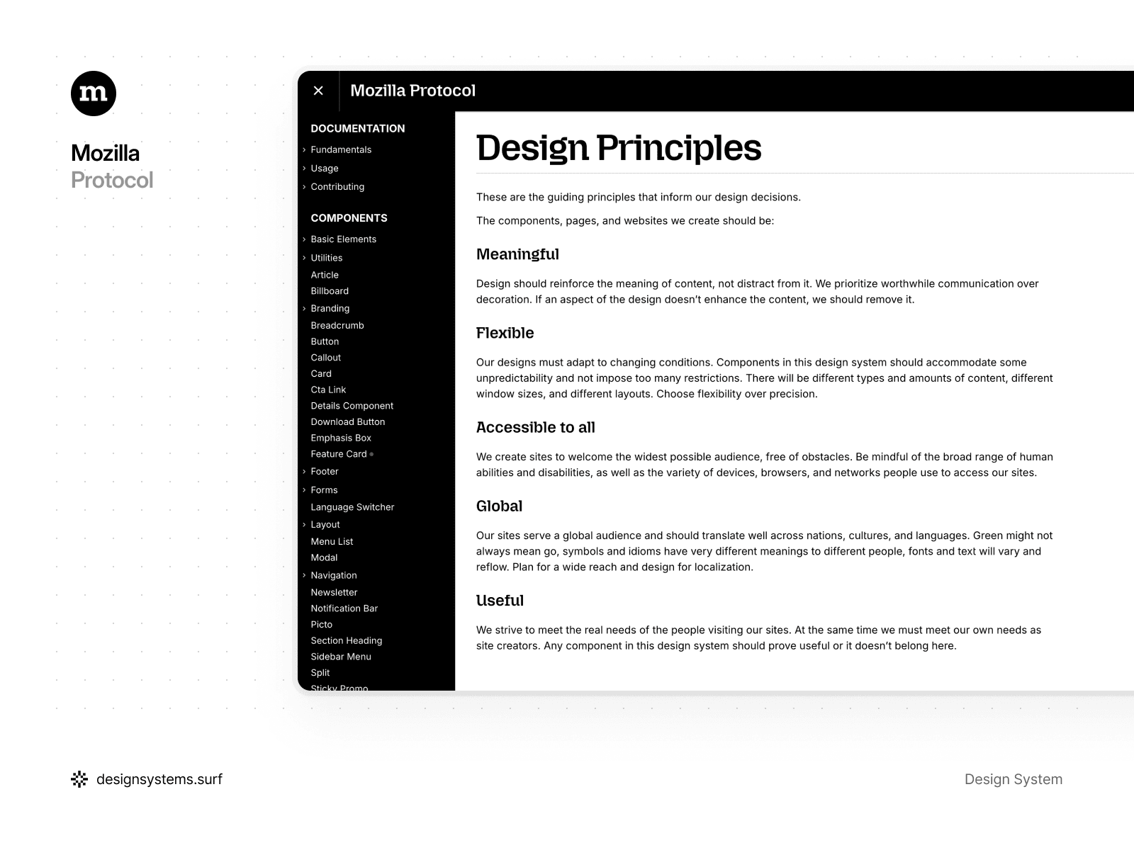
Mozilla’s Protocol Design System
Mozilla Protocol is an open-source design system built for Mozilla and Firefox websites. It establishes a shared design language, ships reusable coded components, and documents the foundations teams need to build consistent experiences on the web.
Protocol is also very web-native in how it’s implemented. At its core, it’s a CSS framework with a pattern library of markup you can assemble into pages, plus a small amount of JavaScript for a few interactive pieces.
Because it is focused on websites rather than complex application UI, it stays intentionally lean. The guidance is concise, the component set is limited, and that makes it quick to learn. It is a good reminder that a lightweight system can still create a strong, consistent brand presence.
What stood out
Protocol puts the fundamentals first. It documents design tokens and even provides them as an npm package, which helps teams avoid hard-coded values and keep UI decisions consistent. The typography guidance is clear about when to use Mozilla-branded versus Firefox-branded typefaces. That level of detail helps prevent subtle brand drift over time. Overall, the system favors flexible rules that work with real content and real layouts, instead of rigid specs that only work in ideal mockups.
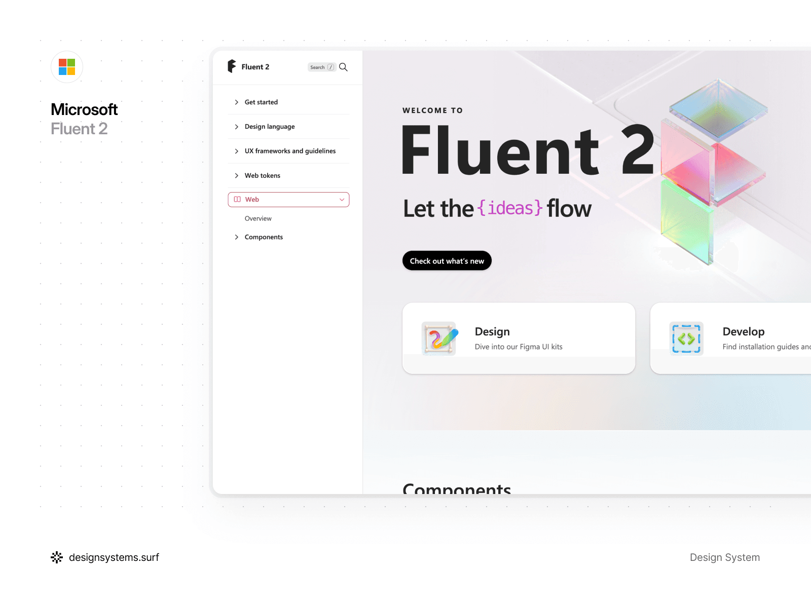
Microsoft’s Fluent 2 Design System
Fluent 2 is Microsoft’s updated design language for building modern, cross-platform product experiences. The foundations stay consistent, and the implementation guidance is split by platform, so you can focus on web, Windows, iOS, or Android without mixing contexts.
Fluent 2 also does a good job supporting the design-to-dev workflow. Microsoft provides Fluent 2 UI kits built in Figma, designed to map to the code libraries for smoother handoff. On the web side, Fluent is available for both React and Web Components, which helps keep experiences consistent even when teams use different stacks.
The guidance is not always extremely deep, but it is approachable. You can get productive quickly, then go deeper into foundations like color, typography, and motion as needed.
What stood out
Fluent 2 feels like a solid “full system” example. It covers the core ingredients most teams need, and it stays practical about real-world constraints. The color model is built around neutral, shared, and brand palettes, and the motion guidance stays focused on hierarchy and attention rather than decoration.
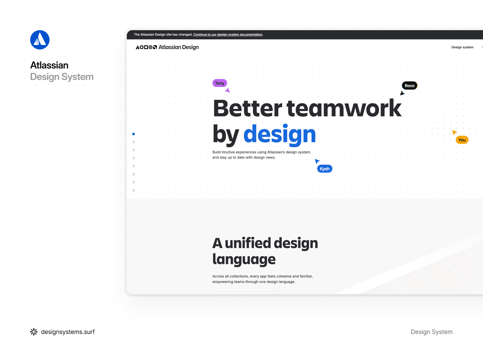
Atlassian Design System
Spend a few minutes in the Atlassian Design System and you can feel the level of craft behind it. Yes, it’s big, and the first pass can feel a little overwhelming. Given how many products it supports, the structure stays impressively clear, and the documentation makes it easy to find what you need without getting lost.
What stood out
Atlassian treats elevation in a straightforward, sensible way. In light mode, depth is primarily communicated through shadows. In dark mode, they combine shadows with color to keep surfaces readable without relying on heavy contrast.
Elevation is defined with a small set of design tokens, which is exactly what most teams need. One token sits below the default surface level, which is useful for “sunken” UI elements that should feel recessed. Each elevation color token also has a corresponding shadow token, which helps teams apply elevation consistently across components and layouts.
The color system is another highlight. Atlassian uses alpha, or transparent, colors alongside solid ones. That’s a practical UI choice. Semi-transparent foreground colors hold up better across different backgrounds, so the result stays consistent even as surfaces change.
Token naming is also done well. The conventions are intuitive, and Atlassian supports it with tools like a token picker, which makes it easier to find the right token and apply it correctly. If you’re figuring out token naming, this is a great reference to borrow from.
Overall, it is a polished system with comprehensive component guidelines and UI pattern guidance. Definitely one of the design system examples worth studying when you care about consistency at scale.


Hidden gem design systems worth exploring
The well-known systems get most of the attention. Plenty of other design systems are just as worth learning from. Some of the most useful design systems are a little less famous, yet they have excellent documentation, clear component guidelines, and practical UI patterns you can borrow right away. Here are a few under-the-radar design systems that deserve a spot in your bookmarks.
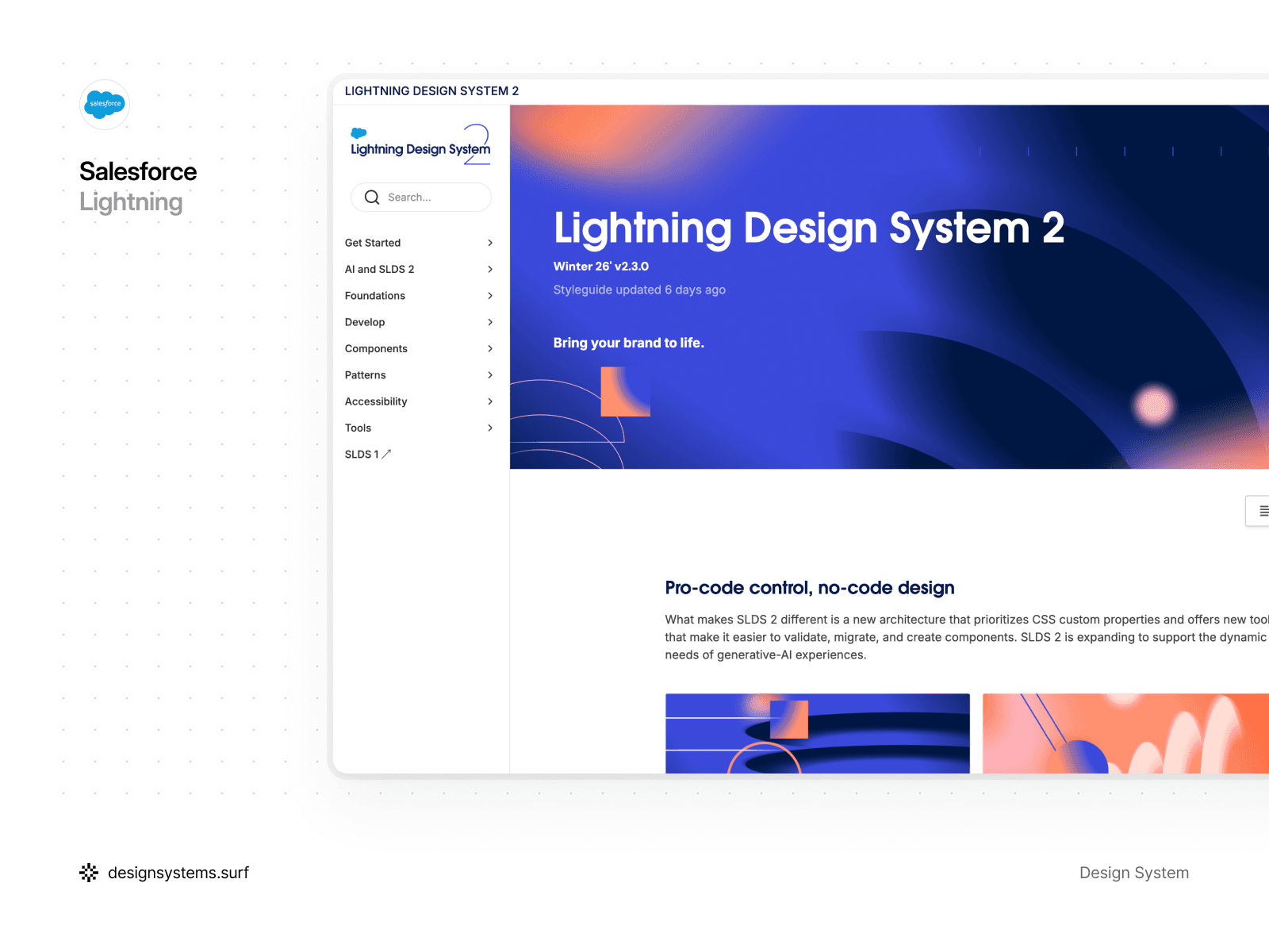
Salesforce Lightning Design System
Salesforce Lightning is built for teams designing enterprise products on top of the Salesforce ecosystem. The goal is simple: help you ship interfaces that feel intuitive, scalable, and consistent across complex CRM workflows. The system is component-driven, tightly aligned with Salesforce product patterns, and clearly optimized for real-world business applications. For teams collecting Salesforce Lightning Design System examples to reference, Lightning’s documentation offers plenty of real UI patterns to learn from.
What stood out
Lightning takes motion seriously. They even give it a dedicated name, “kinetics”, and treat it as a first-class part of the system instead of an optional extra.
That matters because motion often gets deprioritized. It is seen as “nice to have,” or “we’ll do it later,” especially in enterprise software where teams are under constant delivery pressure. Clear motion principles and pattern guidance make it easier to use animation with intention, and to apply it consistently across products, screens, and teams.
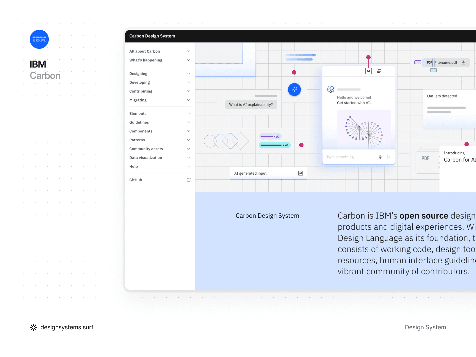
IBM’s Carbon Design System
IBM Carbon is a strong reference system when you need solid, enterprise-ready UI decisions. It is open-source, modular, and built to keep IBM’s product ecosystem consistent, scalable, and accessible. The documentation is dense in a good way, with clear component guidance and enough detail to support designers and engineers working at scale.
What stood out
Carbon’s elevation system is not the usual “more shadow equals more depth.” In many cases, Carbon leans on color to express hierarchy instead.
In dark mode, surfaces get lighter as elevation increases. In light mode, Carbon takes a simpler route and alternates between white and grey across elevation levels. It is a bit unconventional, but it works well in dashboards and enterprise screens where you only need a few layers and want to avoid visual clutter.
Carbon goes beyond component docs. It also covers larger UI patterns like logins, forms, and filtering, so teams can follow the same approach across real flows. That matters because filtering is rarely one-size-fits-all. Carbon helps teams choose patterns that match the context, whether it is a multi-select dropdown or a persistent filter area in the sidebar for heavier data exploration.
For Carbon design system examples in real workflows, check the UI pattern guidance, especially forms and filtering.
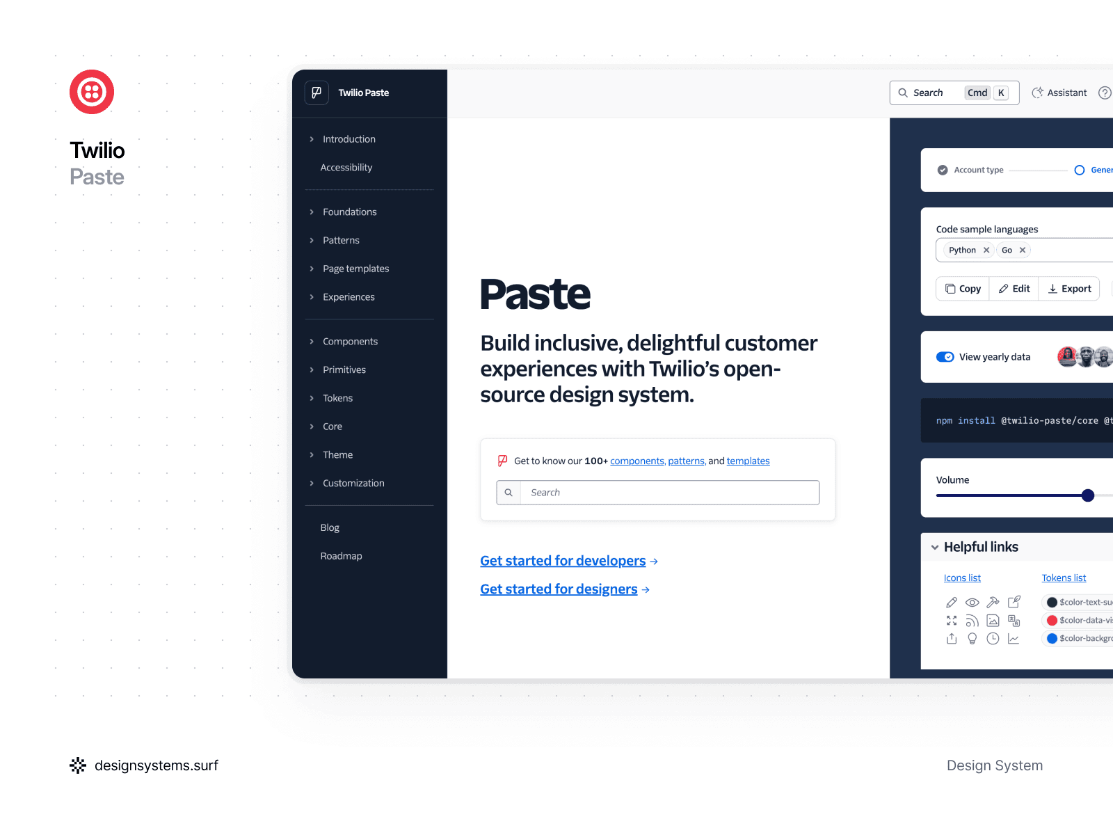
Twilio’s Paste Design System
Twilio Paste is an open-source design system built to help teams ship consistent, accessible customer experiences across Twilio products. It supports both designers and engineers with tooling and assets for Figma and React, plus a large library of components, patterns, and templates.
Paste feels especially relevant if you are building communication-heavy interfaces. Think messaging, support, notifications, and workflow-driven screens where clarity and accessibility matter as much as speed. This design system puts a strong emphasis on inclusive UI, and Twilio aligns parts of its ecosystem with WCAG 2.1 AA, especially in Flex UI.
What stood out
Paste does a great job connecting components to real UI patterns. Their patterns documentation explains how to combine multiple components into repeatable solutions for common flows, so teams do not have to reinvent the same interactions in every feature.
The theming and token story is also very practical. Paste ships a theme package that surfaces design tokens through a Theme Provider for React components, so teams can keep the UI consistent while still supporting multiple themes. If you need to build a custom UI that still looks and feels like the system, Paste shows how to compose with primitives and tokens.
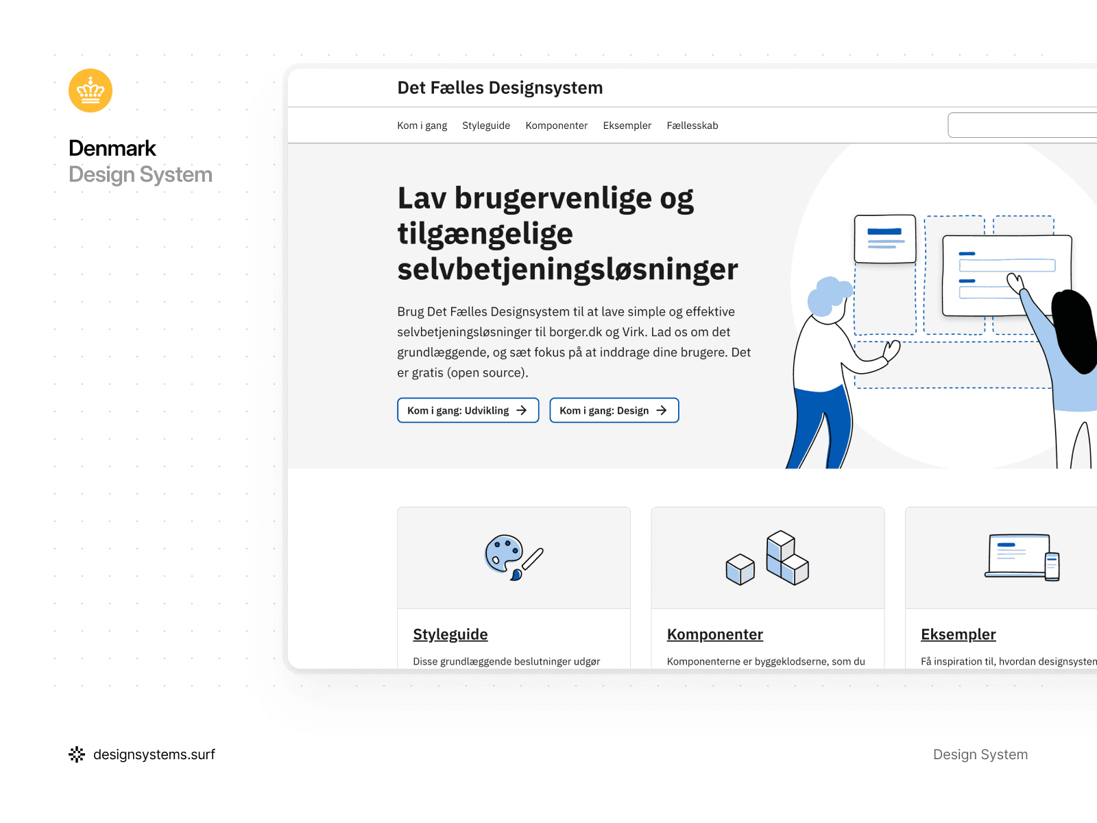
Denmark’s Det Fælles Design System
Denmark’s Det Fælles is the official design system for public self-service solutions, built to support consistent experiences across government services, especially for borger.dk and Virk. It is open-source, and it focuses on practical building blocks: reusable components, clear guidelines, and accessibility-first patterns that help teams ship citizen-facing services that feel familiar and easy to use.
What stood out to us
This is a design system that optimizes for clarity over flair. The style guidance is built around usability in self-service flows, and it stays grounded in the real contexts where these services live. That helps teams avoid “generic gov UI” and build something that actually fits the ecosystem.
I also like that it treats components as building blocks you can combine into patterns for real services, instead of leaving them as standalone UI pieces. That “build the service your users need” angle makes it feel grounded and implementation-friendly.
If you found this article while searching for design system examples, there are two quick clarifications worth adding. One is what people often mean by “graphic” design systems. The other is the checklist I use to evaluate a system when I need something more actionable than a roundup.


A quick note on “graphic” Design Systems
Sometimes people look up graphic design system examples when what they really want is brand guidelines, visual identity rules, and marketing templates. Those are useful, but they solve a different problem. The systems in this article are primarily UI design system examples, built for product interfaces and software experiences.
Still, the overlap is real. The best product systems borrow heavily from graphic foundations like typography, iconography, spacing, and brand visual rules. When the graphic layer is clear, the UI layer becomes easier to keep consistent.
If you want more design systems worth studying, here are a couple more you might have missed.
Want a simple framework to evaluate any Design System?
Lists of “best design system examples” are useful, but they can leave you with the same question. Why is one system easier to adopt, scale, and maintain than another?
To make this more practical, we put together a short framework you can use to review any system you come across. If you want a simple way to sanity-check any design system, our article The Building Blocks of Great Design Systems: 5 Essential Categories breaks it down into five essentials. It starts with the foundations like typography and tokens, then moves into components, patterns, and the documentation that makes the whole thing usable as a real source of truth.
If you are building a system from scratch, auditing an existing one, or collecting ui design system examples for inspiration, this framework helps you spot the gaps quickly and prioritize what to improve next.

